 Often when designing publications or digital content it is easy to get caught up on the end product. How it looks and how it performs are very important to the reader’s journey, but equal consideration must also be given to just how easy it is to physically read on each device the reader will be using.
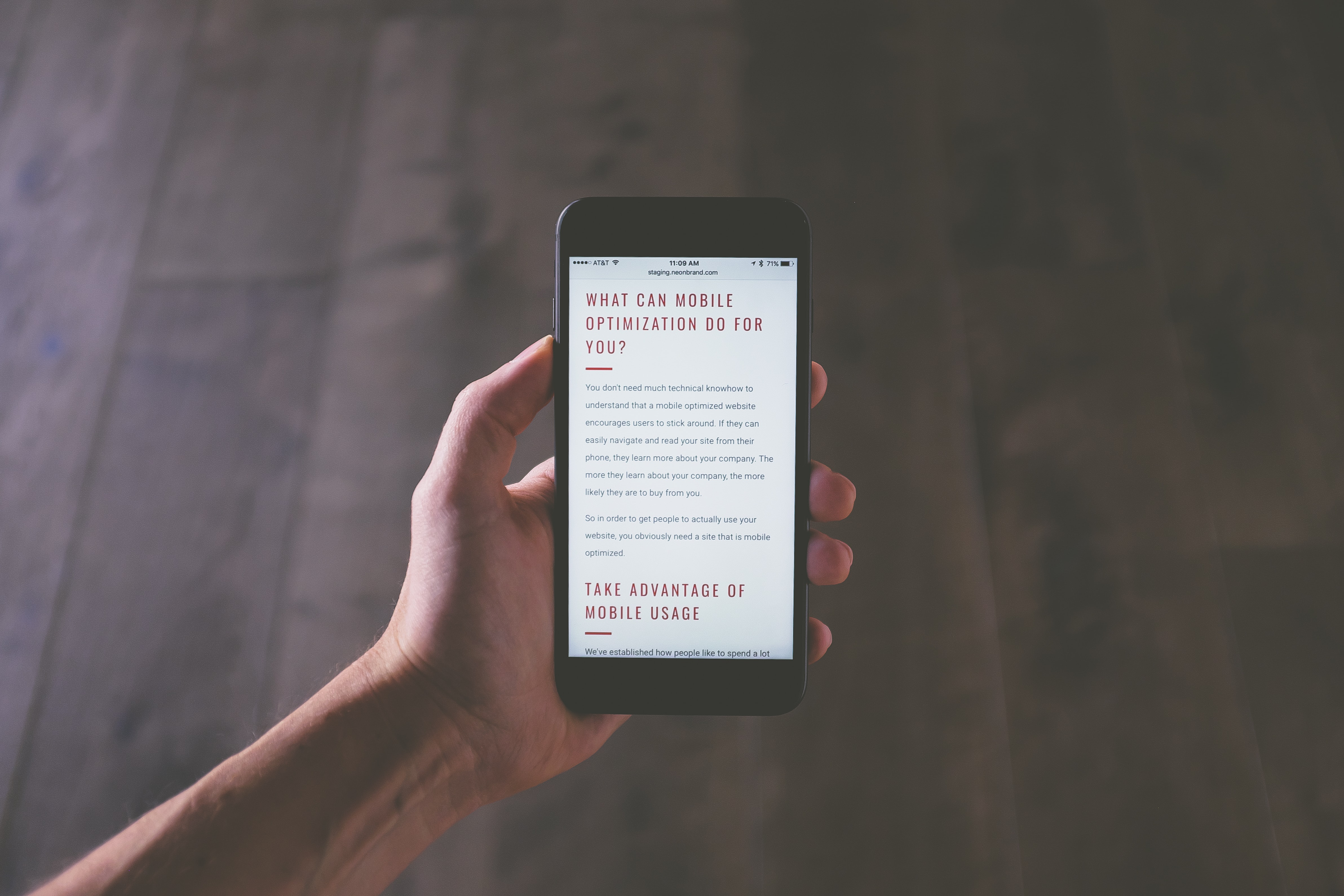
We all know that most readers today digest content on multiple devices; desktops, laptops, tablets and mobile phones, but mobile is the primary device that users tend to read digital publications. Roughly six-in-ten U.S. adults (57%) often get news from their smartphones, compared with 30% who often read from a desktop or laptop computer, according to a Pew Research Center survey. And when we think about the reality of our day, this makes sense – We read the morning ‘newspaper’ on our phones at the kitchen table while drinking our coffee, the article a coworker shared is usually read from our mobile phone while we take our afternoon tea break, or (if you’re a parent) we research parenting strategies while we lay in the dark beside our children as we desperately try to get them to fall asleep.
Our phones have turned into our primary source for digital publications, so content today should of course be responsive to a mobile device, but it also needs to be designed for how that reader physically reads the content on their mobile device. You can read more here: Is design for multi-screens causing you a headache? There are some easy design considerations to make to ensure your content is easily digestible for a mobile reader.
1.Thumb friendly design:
When designing digital content always ensure you have a thumb friendly design. As users today expect mobile first, your design should meet them where they are. Content should be designed with the most accessible navigation points such as page navigation and buttons within the thumb-reaching radius. Think drinking your coffee in one hand, holding your phone in the other. The reader’s thumb has to be able to reach and push the most important elements of your content without adjusting their hold on the device.
2. Intuitive navigation:
Once the reader opens your publication, what do you want them to do? Think about the path your reader will typically take to read, and try to map that out in an intuitive way, and then design your mobile menu around these tasks. Make your responsive publications navigation intuitive and self-explanatory. Simplifying your mobile contents menu with the top 3 – 5 tasks you want the reader to do will give a better user experience, readers will find their next step easily, and it avoids the clutter. You can also add an expand button for a full menu, but keeping it short will improve the user experience.
3. Include a search button
Your intuitive path, and simplified menu should work the majority of the time for mobile readers, but to ensure the best user experience, always have the search field available. There will always be elements that just don’t fit in so easily into a menu, or navigation button, so having a mobile search option allows the reader to find what they need easily.
4. Make buttons accessible
Buttons should always be usable for readers. Oftentimes buttons can be built that are too small and can cause frustration for your readers who might need to pinch the screen to zoom to push it, or they might accidentally push another button first. Try keeping your buttons at least 10mm x 10mm for optimal results and only use them when necessary to the journey to avoid clutter. Read more about the important of accessibility here.
5. Test, test, test!
As mentioned above, your users typically read the same content on multiple devices, you should be testing your content on all devices. Previewing how it looks on each device will allow you to see the differences in user experience across different devices, and always make sure you are testing how thumb friendly your navigation is.
When building your content, always keep your mobile readers on the top of mind, and understand that too much clutter can hurt the user experience on a mobile device. Using a content experience platform like Experios can take the headache away from the design, it will auto reshape your content to fit seamlessly onto a mobile screen, meaning you do not need to manually adjust your image size to avoid your readers endlessly scrolling to read the next paragraph, or reducing text to meet the device parameters. Experios takes care of the nitty gritty for you and seamlessly creates beautiful responsive content for any device.
However you choose to create mobile content, whether it’s mobile and desktop separately, or building content one time that is responsive to all devices, you should always be considering the natural intuition of the reader on a mobile device, and build your content navigation around their thumb!
If you are ready to begin building responsive content, start your free trial of Experios today!
About Experios
Experios is 3D Issue’s all new Content Creation Platform that produces stunning responsive digital publications in a magazine type format. Build and design your publications from scratch with our unique drag and drop editor, publish anywhere even on your own domain, and track your performance with a full tracking and analytics package that can link to your Google Analytics so you can always measure the success of your digital content. You can get started with Experios for free today, schedule a demo or start your free trial.
