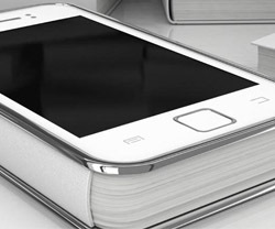
 With an online digital magazine, it’s essential to engage your readers with your content. Readers like to have simplicity and quality. Your publication must focus on design, optimisation and loading speeds to enhance your users experience. Today we live in a mobile-centric world with more and more users accessing your content with their smartphones and Iphones. In actual fact, mobile search and internet usage has surpassed desktop.
When choosing the right digital magazine software, it’s fundamental to ask yourself, is your magazine content optimized well for mobile? Will your magazine run smoothly on mobile devices? It’s more important now than ever to adapt and optimize for the mobile market. Mobile devices are continuously improving but with some digital magazine software they still don’t provide the same experience as a desktop does. With the new release of our latest software, FlipBooks V9, we aimed to address this issue by improving the mobile experience.
Why create two versions of the same publication?
In today’s digital magazine market, creating one publication for all desktop, tablet and mobile audiences is simply not sufficient for guaranteeing the best user experience.
We at 3Dissue felt that the same experience could not be guaranteed by offering the same magazine for both mobile and desktop audiences given the vast difference in screen sizes. So, what was the solution you ask? To create two versions of the same publication. Therefore, allowing each audience, be it mobile or desktop, to not have their experiences hampered when viewing the publication on whatever device they select. We changed how the magazines were rendered on the different devices however from the user’s perspective they are the same.
Tiler output
The quality of your magazine is tremendously important however so is speed of delivery. Your digital magazine needs to feature high quality images and easily legible text that renders at high speed across all devices.
With screen sizes, browser memory and caching allocation being much smaller on mobile, we created a new technology that essentially breaks each page into hundreds of ‘tiles’, then only loads in the part of the page that fits within the devices screen whilst also loading all other parts of the page around that current view. This new technology increases the speed and loading of your mobile editions by a factor of five. Since your audience is more often on mobile devices, this makes it a critical update!
Check out this sample on your mobile:
In summary:
• FlipBooks version 9 creates two versions of the same publication. One for larger screen readers and one for mobile.
• We changed how the magazines are rendered on the different devices however from the user’s perspective, the outputted magazines would look precisely the same.
With our latest update, we clearly recognised that an optimized reading experience should be prioritized. This means that the text and images are utilizing the resolution and catering to the screen size of the device, be it desktop, tablet or mobile. With an online digital magazine, readers want an engaging experience. In a mobile centric world, it’s vital to have a mobile centric magazine!
Version 9 is ready to try out, you can download for Windows and Mac here.


