 When you are creating a publication in today’s world you must ask yourself: ‘where is my audience and how are they going to consume my content?’. If you tell me that your audience is all physical and that a digital replication of that publication is sufficient for your online audience, then I would tell you, you are wrong. While PDFs or digital flipbooks are an important tool for showcasing potential advertisers, audiences outside of your standard distribution network or as an after-sales add-on, it would not be the preferred method of consumption for most audiences. Readers today want content optimized for the device they are currently using, and that would be through a responsive design publication.
What is responsive content?
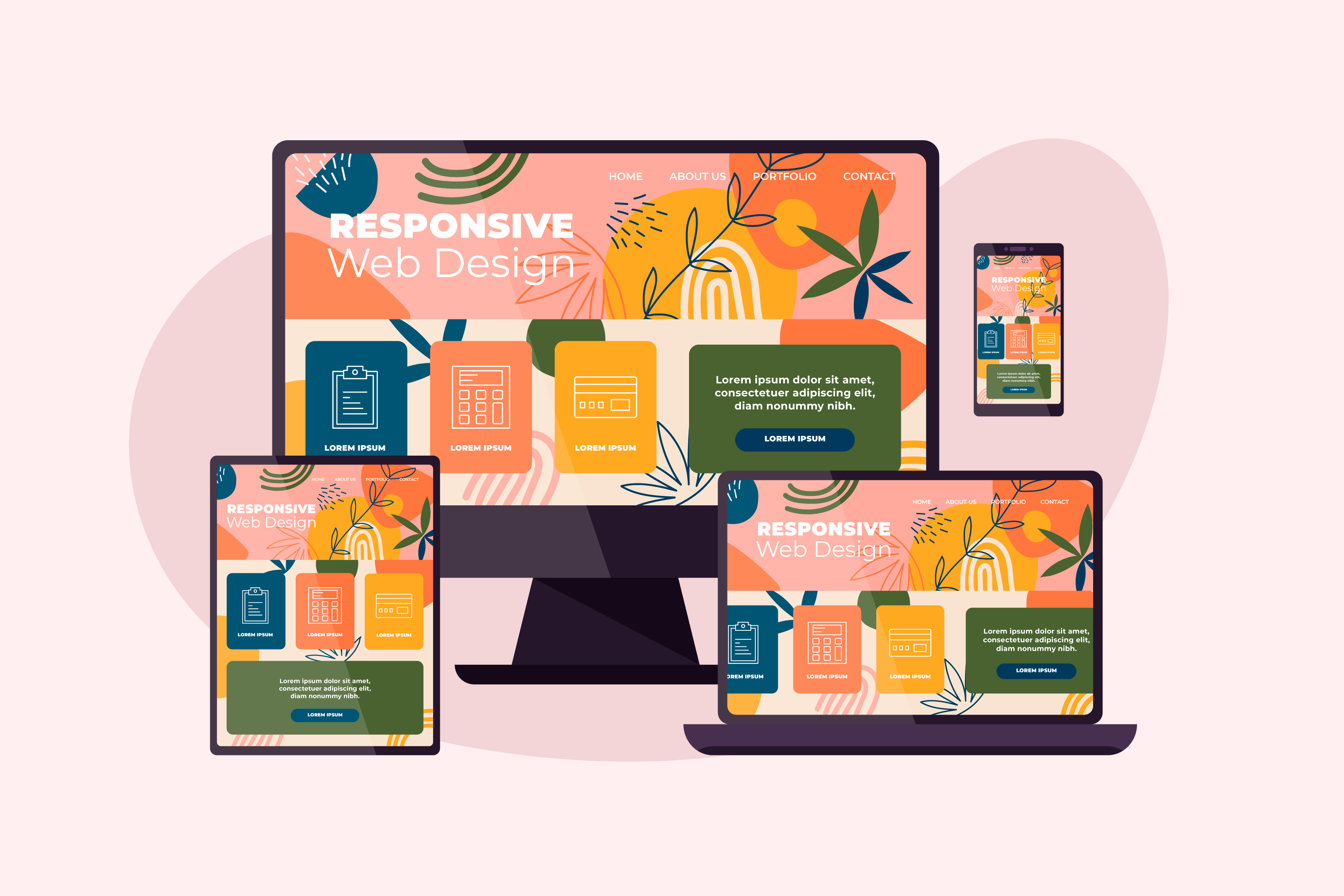
Responsive content refers to content that is designed and optimized to adapt to different screen sizes and devices, providing an optimal user experience regardless of the device used to access it. This includes text, images, videos, and other forms of content that are designed to be easily readable and accessible on different screen sizes, from mobile devices to desktop computers. This is different than adaptive design, which requires a separate layout design for each device the content will be viewed upon.
In the mobile centric world, responsive content is vital, so here are 20 different reasons why it is critical to your content marketing strategy that your content is published in responsive frameworks:
1. We no longer behave the same way, thanks to mobile!
We all know that mobile traffic has surpassed desktop, and our navigational behavior on mobile has already been ingrained into us. Swipe down to read, and swipe left and right to change pages etc. Anything else is counter-intuitive to how we expect to consume content and forces readers to apply different device mentality on their device of choice.
At the same time, the desktop design should not be dismissed; mobile-first should not be the target, as mobile and desktop designs are equally important to the end users experience. Users are increasingly accessing websites from a variety of devices with different screen sizes and orientations. Studies have shown that up to 90% of users switch between devices to complete tasks, meaning they may view the same content on multiple devices and 67% of buyers look at decision making content on more than one device. Mobile readers should not be forced to view the desktop experience while desktop readers want more than the mobile experience. If your content is in a responsive framework then it guarantees that the reader is offered the same rich experience, regardless of what device they chose to consume that content on.
2. It enriches the experience for every visitor
As the content changes to suit the reader on their device of choice, responsive design looks at how it can change the representation of content to ensure that it is optimized for each individual experience. For example, ensuring the fonts are the right size, the navigation is reflective of their expected experience on that device, media such as images, videos etc. are optimized for that resolution. Anything else is a hurdle that you place in front of your reader in the journey to consuming your content, and every hurdle will cause you to lose huge portions of your audience.
3. Readers will be more engaged
All content has a goal or a marketing qualified objective, whether it is to click on a call to action or brand reinforcement, there is a path designed to take the audience towards the end objective. Responsive experiences have faster loading speeds, easier navigation, and better user experience, which makes the content more consumable and accessible. This means that more of the audience will flow down the marketing qualified objective funnel, leading to more goals being achieved.
4. Google likes Responsive frameworks! Fixed, not so much.
We all know that responsive design on websites leads to better indexing on search engines, reduced bounce rates, improved load time and improved content consistency. Despite this, some publishers and content creators have experiences that they want to project in a fixed layout, like Print publishers as it is important for them to showcase their print publications in digital replicas like flipbooks. And while this this important and has a role for advertisers or consumers outside physical distribution networks, there is a further need to meet audiences where they are. Today, most of the layout designs done in a fixed format can also be done with responsive designs, which means it is easy to create a digital replica in a responsive format, while also appeasing Google and other search engines, meaning your digital content will be read by more readers.
5. Free up designers’ time
With responsive design, it is easier to open up your projects to more of your team. If you ask a fixed layout designer what one of the most disliked aspects of their job is, the amount of iterations will almost always be the answer. As peers or clients most likely don’t have access to the tools that designers use to make fixed layouts such as Adobe Creative suite, the onus falls on the designer to make tweaks. The constant requests from peers or customers to make changes can be taxing on designers. Leading responsive platforms have team functionality that means that designers can open up limited versions of the work for non-design orientated people which will allow them to make changes to text and images without the ability to change layout settings or branding. Creating one design that optimizes for every device, versus an individual design for each screen will also dramatically save the designers time and resources!
6. If you’re not ADA compliant, then you are liable.
Accessible content is one of the biggest issues for many content creators, it is more important than ever that every piece of content produced is accessible to every reader, regardless of their abilities. Fixed layout content is not responsive and therefore not compliant. It is easier to design accessible content when done in a responsive framework. The number of court cases brought against companies for non-ADA compliance has increased 10 fold in the last year with an average cost of $50,000. It is time to ensure your content is accessible to everyone.
7. Protect your brand from decline
Responsive experiences ensure that your brand is consistent across all devices. This might not lead to rave reviews but non-responsive experiences will certainly damage your brand. Your content is not the only place your consumers visit, so if it does not meet their expectations, they will leave. By ensuring your content is in a responsive framework you are guaranteeing a shared optimum experience across all devices. This projects trusts while at the same time ensuring your presence and visibility in the marketplace as mentioned earlier, Google gives preference to responsive content over fixed layout content.
8. Load time is key

I once attended a talk that was attended by 2 of the top Google search algorithm engineers, they stated that for every second it takes to load, you lose 50% of your audience. We all know how hard traffic is to build, so it is important to ensure that your content is in a fast loading framework. A responsive framework will often create different file sizes of media like images and videos to optimize for smaller resolutions to ensure an efficient load time, but in a fixed layout there is no optimization option which means longer load times and less than optimal user experience.
9. 1 platform means better cost savings
In a time where cost is key, responsive publishing can save time, money and resources. Responsive content designed in a single platform can offer the same rich experience for your audience across all devices, so you won’t have to maintain a separate desktop and mobile experience which brings savings to you.
10. Real time data
Responsive experiences are natural HTML and web friendly formats which are analyzed in the manner as a web page and therefore the feedback can be instant and detailed offering insights into readership, traffic, events and conversions.
11. Future-proofing
When creating new mobile devices or developing new browsers or even enhancements to existing browsers, developers look to the standard of the World Wide Web Consortium (W3C) which sets the standards for HTML and CSS. While also ensuring close adherence to Web Content Accessibility Guidelines (WCAG). While Fixed layout design works today, tomorrow it will be in the past. With a responsive experience you are already optimizing your content to work with devices that have not even been released yet as responsive design is built on those standards.
12. Better experiences lead to better conversion rates
Ask any web developer and they will tell you that another tenet of web design is “less is more” so the less navigational hurdles you place in front of the reader the better return on investment you will get. Responsive makes the journey easier and this will mean you get an increase in ROI.
13. Responsiveness means trust
A fixed layout publication experience is often different to how the reader wants to consume that content. Responsive design implies investment and projects trustworthiness and professionalism, as it provides a consistent experience across all devices.
14. Improved reader interaction.

One thing that responsive design optimizes on is the different forms of behavior that happen on other devices. For example, navigation and gestures will be different on a desktop vs mobile. Clicks vs touches, or how popups appear in the mobile experience. Using a responsive framework that offers alternatives for the reader within a single experience will result in a more interactive reader.
15. App publishing
A lot of publishers have apps and many of those apps are empowered with the ability to import content from live pages. If the content is in a responsive framework then it can easily be pulled into an app and viewed within that app experience. If the reader is even just on a mobile device browser the content will be reflective of a mobile app experience.
16. Offline Reading
Responsive experiences are natural HTML and web friendly files that will run in offline mode as the files will be cached. So if you are in an area where there is poor coverage you will still be able to consume content. Fixed layout experiences are image intensive and require large file downloads meaning the experience is not optimal for offline or poor service consumption.
17. Responsive experience will attract more readers
These content experiences are more indexable, accessible, and readable. Google loves responsive content and as a result your content will score better which will mean more traffic and readers engaging with your brand without any device or location restrictions.
18. Easier to maintain
Having all of your content in a single responsive framework means that it will be easier on your busy team and resources, especially if you use pre-designed templates. It is simple to make changes and republish, without having to recall content, announce republications or remove content to update.
19. Social sharing

Responsive experiences are more shareable than fixed layout experience. Do you remember ever having to view a fixed layout web page in FaceBook’s embedded browser? Total nightmare. Social embedded browsers are even more limiting than standard browsers as these are inside of an app that they want to protect and are more cautious to the types of content they will allow to run inside their apps and the memory that they will permit through. With device sensitivity, responsive experiences are already set to cater for that.
20. Easier to translate & localize
Responsive Experience text is natural HTML text and therefore can be instantly translated by any browser so that audiences outside of your standard markets can easily access your content. Automatic translations have improved dramatically over the last few years and now with the injection of AI into the mix it’s about to go at light speed. You can leverage tools such as Google Translate into your publications so that they can be automatically translated into any language in seconds.
Conclusion
Ensuring that your content is responsive is crucial in today’s digital age. With more and more people accessing the internet and consuming content through a variety of devices, it’s essential that your content is able to adapt to different screen sizes and display properly. Responsive content not only provides a better user experience, but it can also lead to increased engagement, improved search engine rankings, and ultimately, higher conversions. With the multitude of benefits that come with responsive content, it’s clear that it’s a must-have for any website or digital marketing strategy.
About Experios
Experios is 3D Issue’s all new Content Experience platform that produces stunning responsive digital publications in a magazine type format. Build and design your publications from scratch, publish anywhere and track your performance with a full tracking and analytics package that can link to your Google Analytics so you can always measure the success of your digital content. You can get started with Experios for free today, schedule a demo or start your free trial.
