Settings for each element in a publication can be modified using the ‘Properties’ Control Column. Available properties differ depending on the particular element, and are divided into related groups. These groups are:
- General
- Background
- Border
- Animations
- Arrow (Rows only)
- Settings
- Overlay
- Advanced
- Accessibility
- Classes (Only when Developer Tools are enabled)
Let’s have a look at what properties are typically contained in each section.
General
- Width/Height
Define the dimensions of your element. These can be set as %, px, vw or em.
Auto width will allow the element to fill whatever space is available to it.
Auto height will make the element take on the height of its contents. - Max height/Min height
Restrict your element’s to force it to fall between these two values. - Padding
Creates a space between the edge of an element and its content.
Separate values for left, top, right and bottom. Can be set as %, px, vw or em. - Margins
Add space around the outside of an element.
Separate values for left, top, right and bottom. Can be set as %, px, vw or em. - Color
Assigning a color to an element will affect the color of any text appearing inside the element (unless overridden by setting a different color on a child element).
Background
- Background Color
Fill the background of an element with a single color. This color can supports transparency. This color can be selected using the built-in color picker, or by manually entering an rgb, rgba or hexadecimal value. - Background Image
Assign a graphical background to an element using the Studio Media Library. You can upload and select an image of your own, or select from a library of stock images.
Once an element has had a Background Image set, an extra icon will appear on that element’s label. Clicking on this icon will open the Background settings in the Properties Control Column.
Once a Background Image has been set, an additional set of controls become available, allowing you to manipulate how the Background Image is displayed. These are:-
- Background Size
- Background Position x
- Background Position y
- Background Attachment
- Background Repeat
-
- Gradient Type
Fill an element’s background with a gradient that blends smoothly between two colors. Gradients can be Linear or Radial. When a Gradient Type has been selected, additional options become available in order to select the colors, position and direction of the gradient. - Filter
By enabling the Filter controls, you can apply graphical effects to an element. When enabled, a series of sliders will appear, allowing you to adjust the blur, brightness, contrast, saturation and hue of the selected element and its contents. - Blend Mode
This can be used to achieve color effects on your element backgrounds by setting both a Background Image and a Background Color, and specifying how they should blend together. - Effects
Effects can be used to add a second background image, color or gradient to an element. This could be used, for example, to overlay a tint using a semi-transparent color or gradient. In addition, padding can be defined here in order to create a frame effect on an element.
Border
- Border Radius
Define a radius for the element’s corners. Can be set as % or px. - Border
Select a border width (in pixels or em), style and color. These are defined separately settings for each of the top, right, bottom and left borders.
Animations
- Animation
Select an animation type from the list of available fades, slides and zooms. - Easing
This can be used to control the timing of the animation. There are several possible options here:-
- Ease – The animation begins slowly, speeds up, and then slows down as it comes to the end.
- Linear – Constant animation speed from beginning to end.
- Ease In – Animation starts slowly before achieving a constant speed.
- Ease Out – Animation slows down as it reaches its’ end.
- Ease In Out – The animation begins slowly, speeds up, and then slows down as it comes to the end.
-
- Duration
How long the animation should last in milliseconds (1000ms = 1 second). - Offset
By default, animations fire when a user scrolls to the point where the element would be visible if it wasn’t being animated. By applying an offset, you can specify how many pixels past this point a user should scroll before the animation runs. - Delay
Specify a period of time in milliseconds for an animation to wait before it runs. - Run Once
When checked, the element will remain in its final position after the animation has finished. Deselect this if you want the animation to happen each time the element enters the viewer. - Hide on Mobile
Don’t run this animation on a mobile device. - Hide on Desktop
Don’t run this animation on a desktop device.
Arrow (Rows Only)
Clickable/tappable down arrows can be displayed in Rows. These will navigate a user further down the page, as far as the next row.
- Enable
Choose to display an arrow in this row. - Show on Device(s)
This dropdown allows you to target the device categories on which you want the arrow to display. - Type
Choose an arrow style from one of ten different designs. - Animation
Choose whether to draw attention to the arrow by animating it once when it enters the viewer, or by running a continuous animation. - Color
Select a color for the arrow, either using the color picker, or by entering a rgb, rgba or hexadecimal value. - Opacity
Add transparency to your arrow. Valid values are between 0 (fully transparent) and 1 (fully opaque). - Position
Position the arrow at the left, right or center of the row. - Size
Choose a small, medium or large arrow. - Margin X
In the case of an arrow that has been positioned left or right, Margin X can be used to add some space between the arrow and the edge of the row. - Margin Y
Use this to move your arrow upwards and away from the bottom of the row. - Image
If you would prefer to use your own image for the arrow, click here and use the Image Library to upload your image.
Settings
Differ between elements. Some which appear for all elements:
- Hide on Mobile/Hide on Desktop/Hide in Accessible version
Fill or empty the checkboxes in order to show or hide the element based on device type or publication version being viewed.
Overlay
The Overlay property can be used to apply a decorative shaped border to the top or bottom of an element.
- Enable
Check the box to apply an overlay. - Position
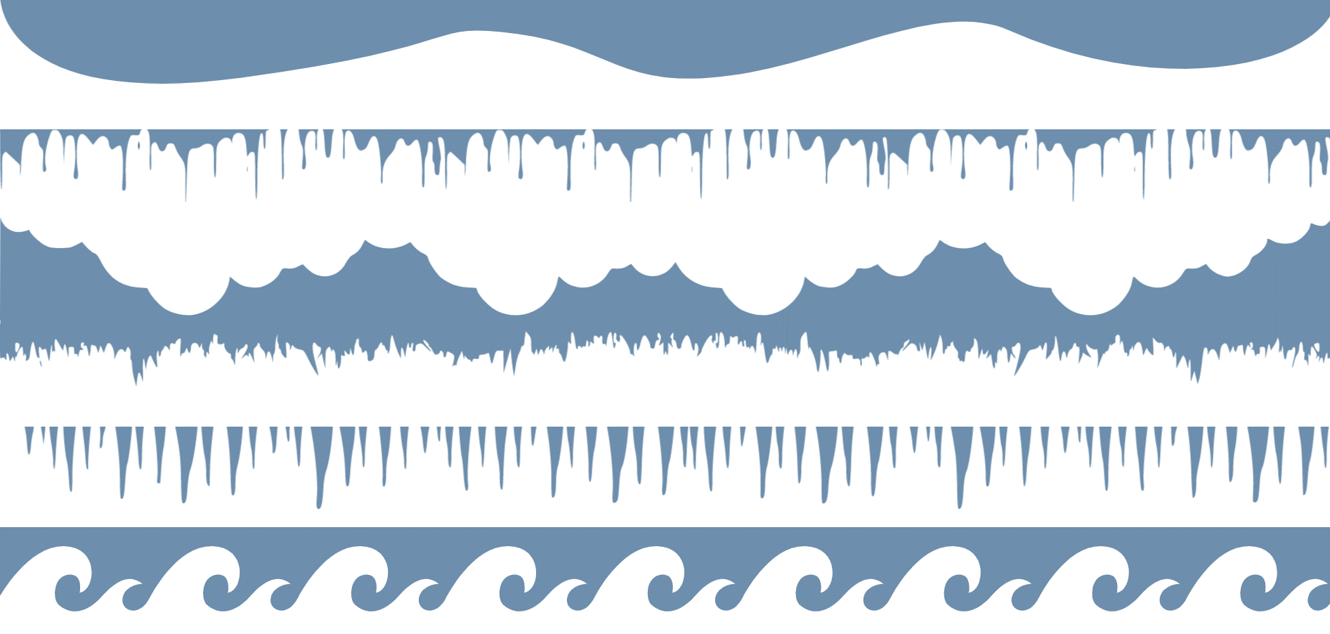
Select whether your overlay should appear at the top or the bottom of your element. - Type
Choose the overlay to apply. Available options are Hills, Blood, Clouds, Grass, Icicles and Waves. - Height
Define how far the overlay should reach from the top/bottom edge of the element. - Width
Stretch or compress the overlay along the width of the element. - Color
Choose a solid (or semi-opaque) color for your overlay using the color-picker, or by entering an rgb, rgba or hexadecimal value. - Opacity
Apply transparency to the overlay by selecting a value between 0 (fully transparent) and 1 (fully opaque). - Flip
Check this box to reverse the overlay on the x-axis. - Bring to Front
Check this box to display the overlay in front of the element’s content. Leave it unchecked to display behind content.
Advanced
- Position
By default, elements are positioned statically. This means that they follow the flow of the page, each appearing after the previous. Studio does, however, offer three other options for positioning elements. These are:- Relative
A relatively positioned element is positioned relative to what its normal static position would be. When relative positioning is selected for an element, the top/right/bottom/left values can be used to move the element away from its normal position. When an element is positioned relatively, other content does not adjust to fill the gap created by moving the element. - Absolute
An absolutely positioned element is positioned relative to its’ nearest ancestor with a position other than ‘static’. If all ancestors have static positions, then an absolutely positioned element will be positioned relative to the page it is on.
When absolute positioning is selected for an element, the top/right/bottom/left values are used to indicate how far the edges of the element should be from the edges of the element is is being positioned within. - Fixed
An element with a Fixed position will remain in the same place in the Studio Viewer, even when a page is scrolled. The top/right/bottom/left values can be used to position the element in the viewer. If these values are not assigned, the element will initially be positioned as if it was relatively positioned.
- Relative
- Position Values
Used in conjunction with the Position property. The effect these have on an element are outlined in the section above. - Z-index
The z-index of an element defines how it stacks with other elements on the page along the z-axis (this can be thought of as an imaginary line between your screen and your eyes). Elements with a higher z-index value will appear in front of those with a lower value. - Opacity
Apply transparency to an element (and its child elements), by entering a percentage value here. 0% is fully transparent, 100% is fully opaque. - Box Shadow
Applies a shadow around the outside or inside of an element’s edges. Options available for defining a Box Shadow are as follows:-
- Box Shadow Color
Define a solid or semi-transparent color for the Box Shadow by entering an rgb, rgba or hexadecimal value here. - Box Shadow h
Horizontal distance in pixels between the element edge and the shadow. Positive values place the shadow to the right of the element. Negative values place the shadow to the left of the element. - Box Shadow v
Vertical distance in pixels between the element edge and the shadow. Positive values place the shadow below the element. Negative values place the shadow above the element. - Box Shadow Blur
Blur radius of the shadow in pixels. Higher values result in a blurrier shadow. - Box Shadow Spread
Spread radius of the shadow in pixels. Positive values will create a bigger shadow. Negative values will create a smaller shadow. - Box Shadow Type
Choose whether you want your Box Shadow to appear on the outside of the element, or to appear as an inner shadow.
- Box Shadow Color
-
- Rollover Text
Using the Rollover Text and Rollover Color properties, you can overlay an element with some additional information when a user hovers their mouse pointer over the element. Enter the text you want to appear in the Rollover Text field, and… - Rollover Color
Define a color for your overlay by entering an rbg, rgba or hexadecimal value in the Rollover Color field.
Accessibility
Accessibility properties help ensure that your publication can be used effectively by people who rely on assistive technologies such as screen readers. The options available in this section vary depending on the selected element.
- Aria Label
An aria label provides an accessible name for an element. Screen readers use this label to describe the purpose of an element when no visible text is available. Aria labels can be useful for clickable images, icon-only buttons, image galleries, etc. - Alt Text
Alt text (alternative text) is primarily used for images and other visual content. Screen readers announce this text to users who cannot see the image, helping them to understand its content or function. - Role
The role property provides semantic meaning to text elements, helping screen readers understand the structure of a page. Available roles include Heading 1-6 (headings in descending level of importance) and Paragraph.
Classes
The following properties are only available to users who have been assigned the Developer role, and only if the Developer Tools option has been enabled in Project Settings.
- Add Class
Click on the + Symbol and fill in the text field to add a class to the selected element. Studio will fix any class names that break class-naming rules. - Remove Class
Click on the x to the right of a class name to remove it.