The pages of a Studio project are made up of grids, consisting of rows, which in turn contain columns.
These allow the page to wrap its contents from left to right and top to bottom, regardless of screen size. This is known as responsive design, and allows for the design of pages that look great on all device sizes, from mobile phone to desktop.
Rows can contain a maximum of 12 columns. You can, however, nest a row inside of a column, allowing for an additional 12 columns inside the parent. Rows and Columns can be dragged from the Add Content panel to the canvas and dropped in position. They can also be nested using the Insert button on the label above an element when it is clicked.
Labels for Rows and Columns display the most frequently used options by default. Labels can be expanded and collapsed by clicking on the three dots icon at the end of the label.
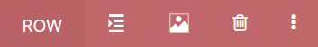

Options available on Row labels are as follows (left to right):
- Indent
Opens a dialogue for adjusting the row margins and padding - Background Image
Add a background image for the row using the Studio Media Library - Delete
Delete the row - Save
Save the row as a Block. You will be prompted to give the block a name, and to select a block category to save it to - Insert Columns
Add a new Column to the beginning or end of the row - Background Color
Select a background color for the Row - Duplicate
Create a copy of this Row. The copy will be placed immediately under the Row being duplicated - Select Parent Element
If the Row is nested inside another element, this will select the containing element. - Expand/Collapse Label
Show or hide Row label options


Options available on Column labels are as follows (left to right):
- Indent
Opens a dialogue for adjusting the Column’s margins and padding - Background Image
Add a background image for the Column using the Studio Media Library - Delete
Delete the Column - Insert Rows
Add a new Row to the beginning or end of the Column - Background Color
Select a background color for the Column - Duplicate
Create a copy of this Column. The copy will be placed immediately after the Column being duplicated - Select Parent Element
Select the Row containing the Column - Expand/Collapse Label
Show or hide Column label options
Row heights and widths are set to ‘auto’ by default, meaning that they will always expand to fit their contents. These defaults can be changed from within the Properties panel to the right-hand-side of the canvas.
Elements must be placed inside a column. In the case that an element is added to the canvas outside of an existing row/column, Studio will automatically wrap the element in a new row and/or column as necessary.