Elements are the individual components that make up your Studio project’s Pages. Examples of elements include text, images, buttons and videos.
The Add button at the top of the left-hand rail opens the panel that supplies everything you place on the canvas — from a single heading to a complete page layout.
Elements
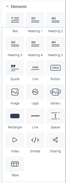
The Elements section of the Add panel lists the individual building blocks of your design.
- Text tools: Text for body copy, Heading 1 through Heading 5 for titles and section headers, and Quote for pull quotes.
- Interactive: Link, Button, Sharing, and Embed for anything your readers click or interact with.
- Media: Image, Logo, Gallery, and Video.
- Structure: Rectangle, Line, Spacer, and Table for layout and organization.
Link and Button share one edit dialog and carry a reference page each: Link and Button.
The structure elements are described together in Shapes, Lines, and Spacers. Product is no longer an element of its own: Product Element (no longer a separate element).
Adding elements
You add an element by opening the Add panel and either:
- You can click an Element icon to place it at the end of the current page, or
- Drag it to the exact spot on the canvas where you want it to appear. When dragging, a line appears on the canvas showing where the element will be placed when you release the mouse button.
Element labels
Once an element is on the canvas, hovering over it shows its element label — a small colored bar above the element displaying its type and a row of icons.

Working from left to right, a typical label contains:
- Handle — click and drag this to reposition the element on the canvas.
- Element type — the name of the element (for example IMAGE or TEXT).
- Element-specific icons — settings, crop, link and other tools depending on the element type.
- Indentation — opens the Indent Panel, where you can set the element’s margins and padding (see Spacing, Padding, and the Indent Panel, e-137).
- Duplicate — creates a copy of the element immediately underneath.
- Trash can — deletes the element.
If an element has a background image applied, an image icon also appears on the label for quick access to the element’s background properties.
Labels are color-coded by structure level: row labels are red, column labels are green, and element labels are blue. This makes it easy to see at a glance whether you are grabbing a row, a column, or a single element.
Element properties
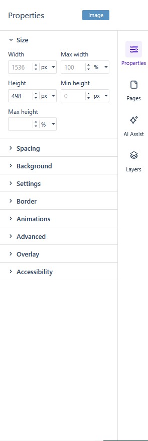
Every element carries a set of properties — its size, spacing, background, border, visibility, accessibility role, and so on. Some properties are universal across element types; others appear only for particular elements (crop on images, autoplay on video, submit URL on forms).
Properties are accessed by selecting an element on the canvas and opening the Properties Control Column (see The Studio Editor). Opening the Properties column without a selection prompts you to select an element first.
Once an element is selected, it stays highlighted on the canvas, and the element type appears at the top of the Properties column. The properties are divided into collapsible groups so you can find the one you want quickly — typical groups are Size, Spacing, Background, Settings, Border, Animations, Advanced, Overlay, and Accessibility.