

You’ll end up knowing how your publication actually behaves on a phone (layout, navigation and playback) before any reader finds it.
You’ll need
- The project open in Studio, Flow or Replicate, whichever one built it.
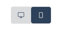
- Studio’s page-bar Desktop / Mobile toggle, or Flow’s canvas-toolbar Desktop/Mobile view button.
- A phone, and the publication’s link once it is published.
Most of your readers will open your publication on a phone. Every 3D Issue product is built to adapt, but “adapts automatically” is a design input, not a guarantee, and the moment to catch a cramped text column or an awkward crop is before you publish. This page collects the mobile checks worth running in each tool, and the one check that matters most: opening the real link on a real device.
In Studio: design for both canvases
Studio projects carry a desktop and a mobile version of your design. Switch the canvas between them with the Desktop / Mobile toggle on the page bar above the canvas (see Getting to Know the Studio Editor Toolbar). This is the layout your phone readers will actually get. Rearrange or resize elements in Mobile view where the desktop arrangement doesn’t translate.
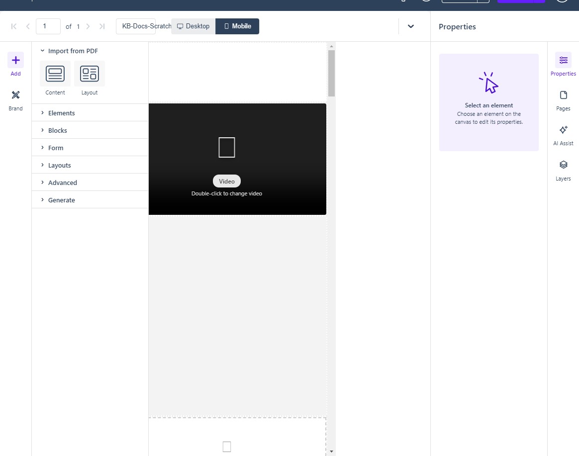
Then preview (see Previewing Your Project): switch the canvas to Mobile first, and run Preview so you click through the publication exactly as a phone reader will. Preview changes nothing and costs nothing: check video playback, animations, and navigation there, not in the editor. If you’ve enabled the Pretext responsive engine (Project Settings → Advanced), scroll a few text-heavy pages in the mobile preview to confirm the reflow reads well; see Understanding the Pretext Responsive Engine.
In Flow: check the reflowed layout
The Flow editor has the same device awareness: a Desktop/Mobile view button on the canvas toolbar, next to Edit crop areas, which controls how images re-crop between the flipbook and the reflowed Flow layout. Switch to Mobile view after enabling Flow and give each page a pass: the reflowed text order and image crops are where mobile surprises live (see Improving Your Flow Publication).
In Replicate: test the reader itself
Replicate has no authoring-time device toggle because there is nothing to re-layout: the flipbook preserves your PDF’s design and scales it to the screen. What you should test is the reader experience on the device: open the published link on a phone in portrait, check that page-turning, zoom, and any interactive elements respond to touch. Zoom quality is limited by the resolution of your source PDF; see Are there any PDF requirements? before re-importing a blurry original.
The reader-side checks (every product)
- Open the real link on a real phone. The preview is faithful, but the published reader is the thing readers get: touch behavior, address-bar handling, and performance only show on the device. Send yourself the link and read it like a reader would.
- Check the Replicate | Flow switch. For Flow-enabled publications, readers flip between the page-turning flipbook and the reflowed Flow layout at bottom-left of the reader.
- Run the accessible version. Every published project has an accessibility-first rendering (linked from the publish dialog, configurable per device in Studio’s Project Settings → Viewer Settings). If accessibility matters for your audience, test it on the phone with its screen reader, VoiceOver on iOS or TalkBack on Android.
- Navigation per device. Studio lets you configure navigation for All devices, or separately for Desktop and Mobile, in Viewer Settings; confirm the mobile navigation choice is the one you intended.
A 60-second pre-publish routine
- Studio: flip the canvas to Mobile and page through the project.
- Run Preview from the mobile canvas (and the Accessible version preview before a public launch).
- Flow projects: repeat in the Flow editor’s Mobile view.
- Publish, then open the link on your phone before sharing it onward.
If it doesn’t work
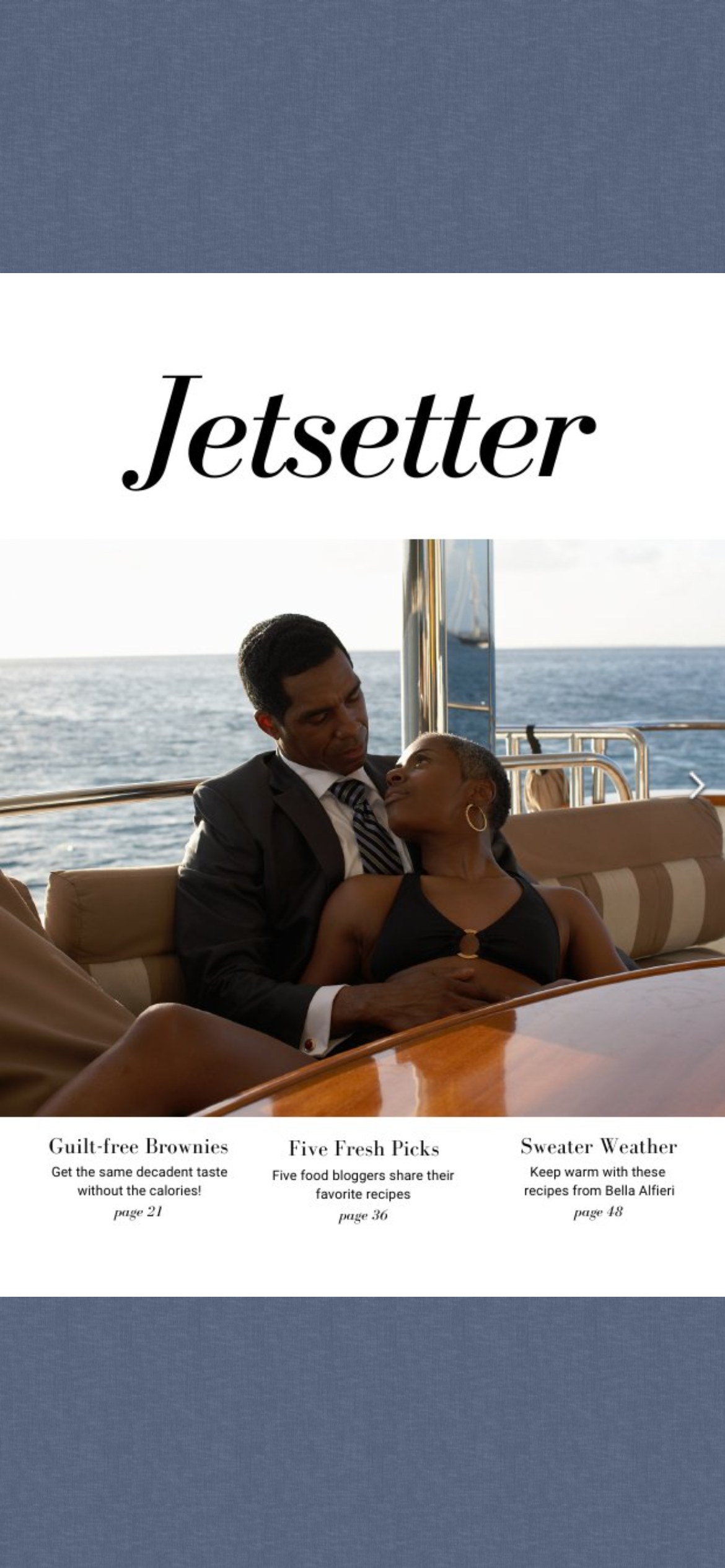
- The mobile layout is cramped or the text column is narrow. Rearrange or resize in Studio’s Mobile view, then run Preview from the mobile canvas; preview changes nothing and costs nothing, so iterate there rather than in the editor.
- Zoom looks blurry. That is the source PDF’s resolution rather than the reader; see Are there any PDF requirements? before re-importing a blurry original.
- The published reader behaves differently from the preview. Check navigation per device in Viewer Settings (All devices, or Desktop and Mobile separately); the mobile setting is what your phone reader gets.
- A video fills the whole phone screen. That is a viewer setting rather than a fault: How do I stop a video filling the whole screen on mobile? (e-123) covers it.