

Whether you started from a blank template, a pre-designed template, or an existing project, the Studio editor opens the same way: your first page on the Canvas, the Control Columns fixed along the right, and the Project panel, opened from the cog in the editor toolbar. Everything you do in Studio happens across those three areas.
The Canvas
The Canvas is where you create and edit your project’s pages. Select any element to work on it, then choose from the options in the Properties Control Column beside the canvas — size, positioning, borders, shadows, opacity, and more (see Configuring Element Properties). Text elements are the exception worth knowing: their actual text edits directly on the canvas, right where the words are. The element and its toolbar have a reference page of their own in Text Elements.
The undo and redo arrows at the top of the Canvas rewind and replay your changes (see Managing Your Work with Undo, Redo, and Version History).
The Control Columns
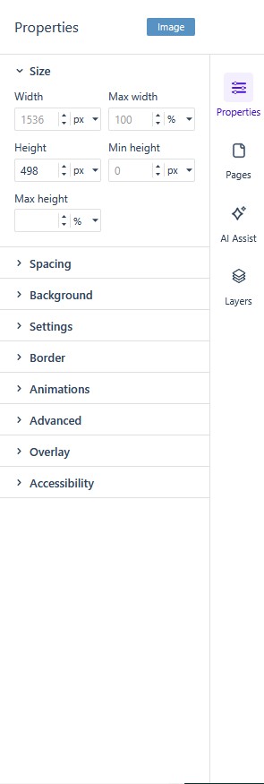
The Control Columns are fixed along the right of the editor window, each covering one aspect of Studio. The four columns read Properties, Pages, AI Assist, and Layers; the Add panel and the Brand rail sit separately on the left of the editor. The interface labels the panels one at a time; Control Columns is this guide’s name for the right-hand set.
- Add (left rail) — the individual elements and pre-built layouts you build with, plus PDF import and Studio’s AI generation features (see Working with Elements and Creating Content with AI).
- Properties — the settings for whatever is selected on the Canvas: size and positioning, borders, shadows, opacity, and the rest of the element’s options.
- AI Assist — Kelda, Studio’s AI chatbot, which handles everything from small alterations to a single element to generating full page layouts.
- Pages — a thumbnail of every page in the project. Click a thumbnail to open that page on the Canvas, or its cog icon for that page’s properties; the three-dots menu inserts, reorders, and locks pages, and the trash icon at the bottom deletes them (see Managing the Pages Panel).
- Layers — a tree-style view of the elements currently on the Canvas (labeled Structure in older documentation). It is the easy way to select an element whose label is hidden, or to reorganize elements into different rows and columns by dragging (see Managing the Layers Panel for the layer-by-layer companion view).
Where to go next
The toolbar that runs above the Canvas carries the page controls and preview — Getting to Know the Studio Editor Toolbar walks it control by control. The cog in the editor toolbar opens the Project panel, where the project’s own settings live. From here, the quickest path is to place your first elements (Working with Elements) and arrange them with rows and columns (Rows, Columns, and Responsive Pages in Studio).