


Studio and Flow ship a set of tools that help you publish content everyone can read: a built-in accessibility checker on every page, per-element descriptions, semantic roles, and an accessible version of the publication.
Checking Accessibility Status
- In the editor, open the editor actions strip and click Check accessibility status. The button shows a ! marker when the current page has findings.
- The page is validated and a list of findings appears.
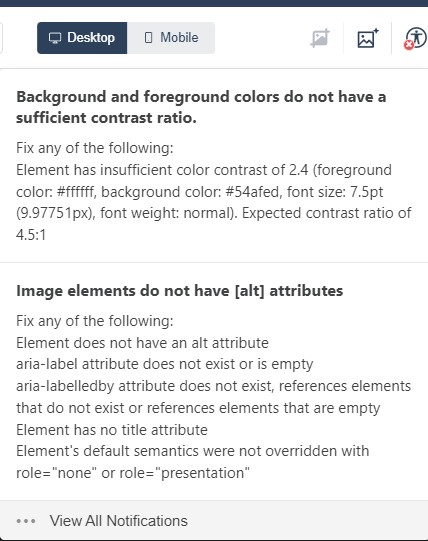
Each finding pairs a plain-language summary with the technical detail, for example:
- “Background and foreground colors do not have a sufficient contrast ratio” — with the computed ratio and the expected minimum (4.5:1), including the exact colors and font size involved.
- “Image elements do not have [alt] attributes” — images that read as empty to assistive technology.
Findings are clickable: selecting one selects the affected element on the canvas so you can fix it (adjust the colors, add the missing description) and run the check again until the page comes back clean.
The Accessibility Validator
The checker is Studio’s built-in Accessibility Validator. It runs on each page individually: navigate to the page you want to check and click the accessibility icon beside the undo/redo controls, wait for validation, and review the list of issues — clicking one scrolls the canvas to the problematic element.
The validator is enabled by default. Its account-level options live on the Compliance tab of the Team screen (user menu → Team):
- WCAG validator shows accessibility checks in the editor while projects are being created (enabled by default).
- Require WCAG compliance before publishing: publishing stays disabled until the required accessibility checks pass (disabled by default; see Why is my project not compliant? (e-127)).
Changes take effect for team members the next time they sign in.
The validator checks for: Alt Text on images; Missing Title Text on elements that require a title; Contrast Ratio; and Invalid HTML (such as markup introduced through Developer Tools (e-351)).
Describing Elements for Screen Readers
With an element selected, open Properties → Accessibility:
- Aria label — a short description of what the element is or does (“Describe this element”).
- Alt — for image-type elements such as images and logos, the alternative text readers hear instead of seeing the picture (“Describe the image”).
- Role marks the semantic role for text elements: Paragraph or Heading 1–6, so assistive technology announces the document structure correctly. See Setting the Text Type (Heading Levels) for choosing the right level.
Accessibility Beyond the Editor
- Accessible preview: Preview options → Accessible version shows the project the way assistive technology will read it (see Previewing Your Project).
- Viewer version: Project Settings → Viewer Settings offers a View version choice between Standard and Accessible — and the panel’s dropdown menu (upper right) switches between editing the standard viewer’s options and the Accessible Viewer’s own settings.
- Published projects: every publish produces a link to the accessible version alongside the standard one (see Publishing and Sharing Your Studio Project).