


The Gallery element places a group of pictures on the page as a single element. You can present them as a grid, a slider, or a masonry layout, and readers can open the full gallery in a lightbox.
Adding a gallery
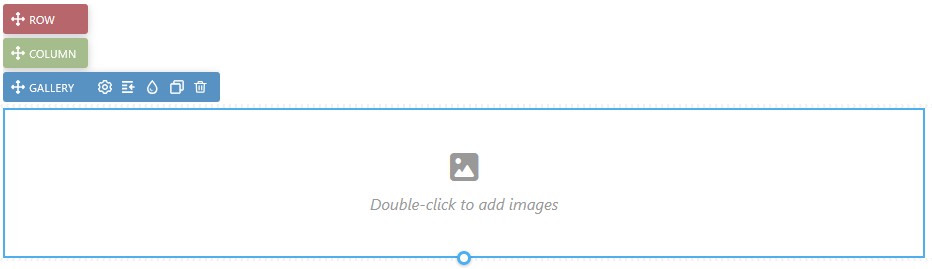
Open the Add panel and insert the Gallery element from the Elements list by clicking it or dragging it onto the canvas. Double-click the placeholder to add your pictures.
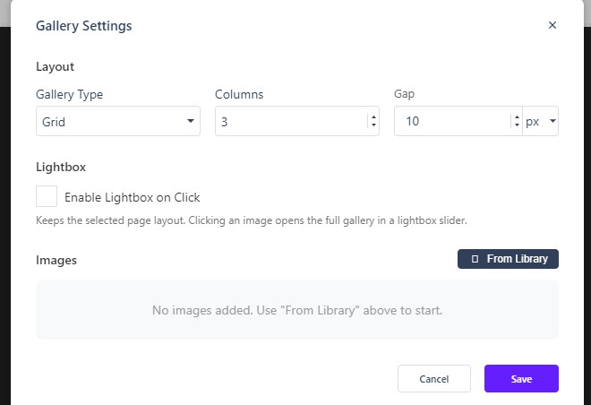
Gallery Settings
Open Gallery Settings to configure the gallery:
- Gallery Type — Grid, Slider, or Masonry.
- Columns sets the number of columns, default 3.
- Gap sets the spacing between images, default 10, with a unit picker.
- Lightbox — enable Enable Lightbox on Click so readers can open the full gallery in a lightbox slider while keeping the selected page layout.
- Images From Library — use From Library to pick the pictures for the gallery.
The Properties panel
Like every element, the Gallery exposes the full Properties panel (Size, Spacing, Background, Settings, Border, Animations, Advanced, Overlay, and Accessibility), so you can control its dimensions and spacing in the same place as the rest of your elements.
In Flow
In Flow, the Gallery element works the same way. Because Flow reflows the layout for smaller screens, the gallery type and column count can matter more there — a slider or masonry layout can sometimes read better on a small screen than a wide grid.