


The Form element adds a form to the page so readers can send information back — for example a contact form, a signup, or a custom set of fields.
Adding a form
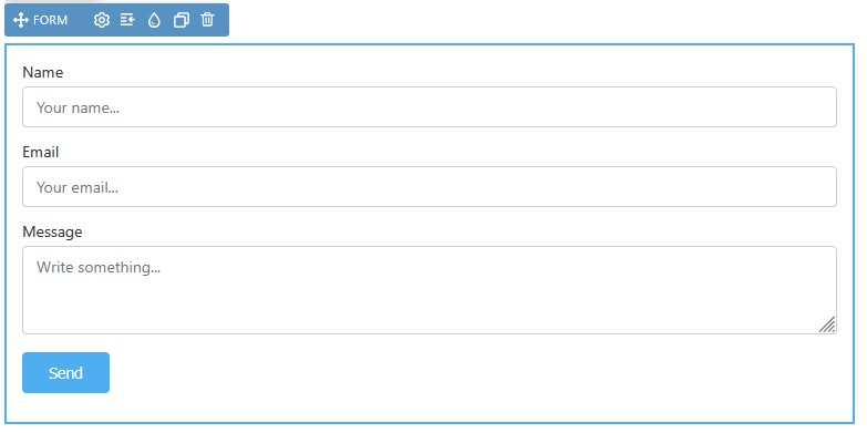
Open the Add panel and insert the Form element from the Form section by clicking it or dragging it onto the canvas. A new form starts as a simple contact form with name, email, message, and a send button.
Customizing the form
You can build out the form with additional input fields as needed. The Form section supplies building blocks such as input, textarea, select, checkbox, radio, button, and label, so you can assemble the fields you want. Each field typically carries its own settings, such as ID, name, placeholder, type, and whether it is required.
Where submissions go
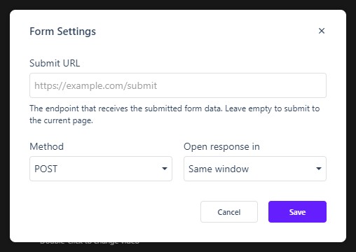
To make the form useful, point it at a script or endpoint that can process the submissions: click Form Settings on the form’s element label — the same settings sit in the Properties Control Column — and fill in Submit URL, the Method (POST or GET), and where the response opens (Same window or New window). Until a handler is in place, the form is non-functional: submissions have nowhere to go.
The Properties panel
Like every element, the Form exposes the full Properties panel — Size, Spacing, Background, Settings, Border, Animations, Advanced, Overlay, and Accessibility — so you can control its dimensions and spacing alongside the rest of your elements.
In Flow
In Flow, the Form element works the same way. As with any form, it needs a handler to process submissions, and it should be checked in preview on desktop, tablet, and mobile so the fields lay out cleanly in the responsive edition.