


The Button element is a clickable button on the page. Under the hood it uses the same control as the Link element, just presented as a button instead of plain link text, so the two are the same control in different clothes, and either can be switched to the other look at any time.
Adding a button
Open the Add panel and insert the Button element by clicking it or dragging it onto the canvas. Its placeholder text is “CLICK HERE”, which you can replace with the caption you want readers to see.
The edit dialog
Select the button and open its edit dialog with Link Settings on its element label. Because Button and Link share the same dialog, anything you can do to a Link you can also do to a Button. The dialog offers:
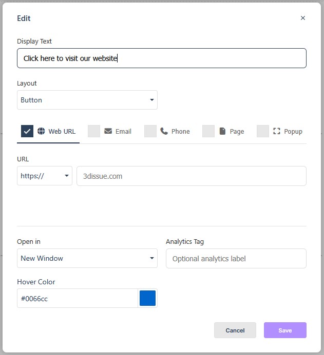
- Display Text is the caption readers see on the button.
- Layout switches between Link (plain text) and Button (clickable button styling).
- Target type sets the kind of destination the button points to.
- Open in — This Window or New Window.
- Analytics Tag — an optional label so clicks can be identified in analytics.
- Hover Color — the color the button turns on hover.
Button targets
The target type determines what the button does when a reader clicks it. The common options are:
- Web URL takes any web address.
- Email — an email address; see Link for its optional prefills.
- Phone is a phone number for tap-to-call.
- Page — an internal jump to another page, with an optional target element name to jump to a named row or element.
- Popup — a URL that opens in a lightbox overlay.
In Flow
In Flow, the Button element works the same way. Buttons are a common way to guide readers in a responsive edition, for example to jump to another page, open a link, or start a phone call, and they behave the same as they do elsewhere.