

Flow’s brand settings sit on the same Brands screen as Replicate’s: open the user menu and choose Brands, then set the product selector at the top to Flow. Which brand a Flow project uses, and where it applies, is in Brands in Flow. The Flow Brands view has a single Styling tab. When you’ve finished editing, choose Save changes (top right).
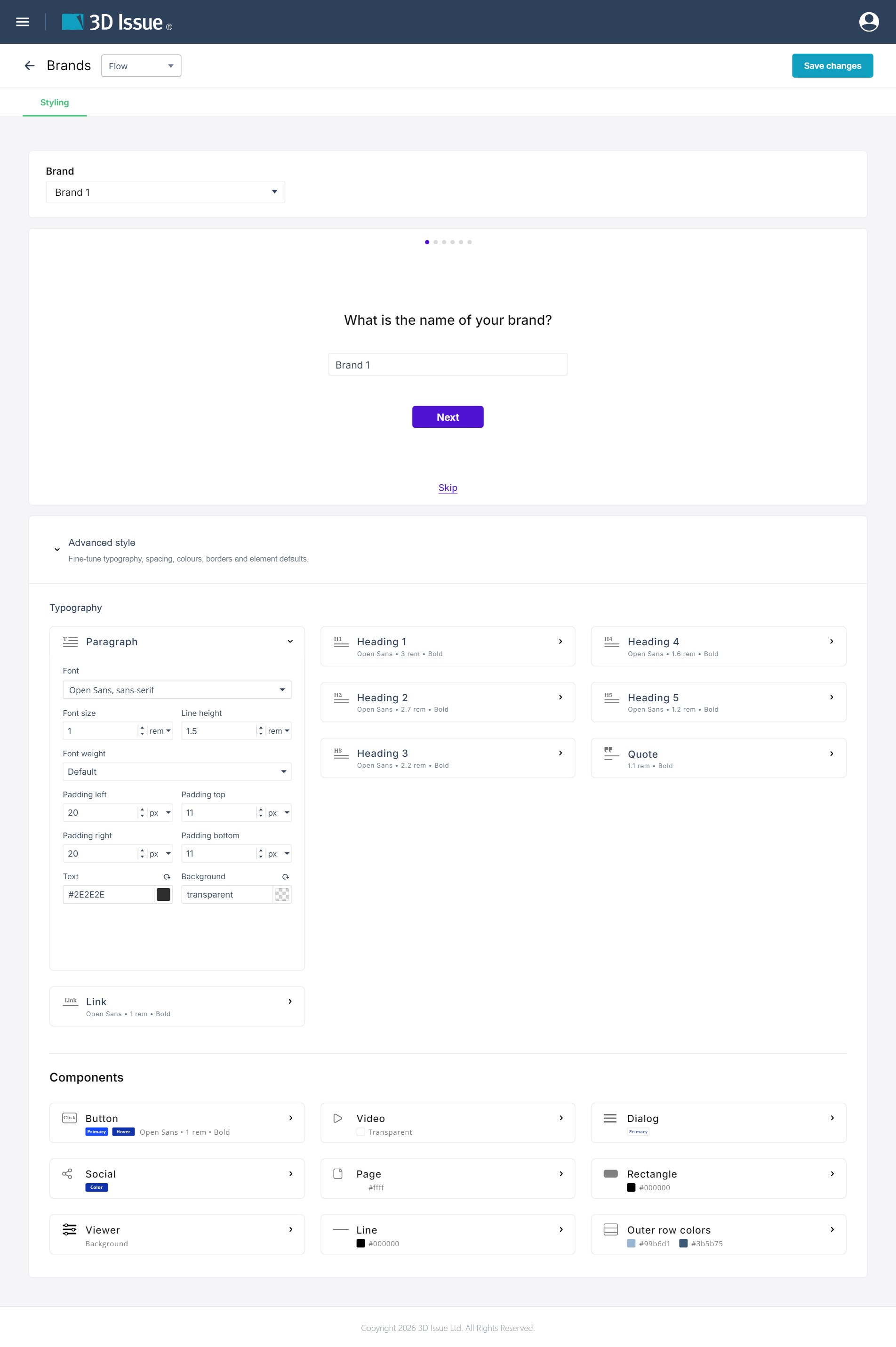
Brand Setup
The Brand Setup card is the only identity card on the Flow view, and it works in two states. A brand that has not been through them runs the guided questions in place: six questions — the brand’s name, its industry, its logos, its colors, its fonts, and the type of content you are creating — with Next to advance and Skip to pass a question. The dots above each question mark the step you are on.
The card switches to the summary as soon as the brand carries any one of those answers — a logo, an industry, a project type, or either font. The summary lists Industry, Logos (with a count of what is uploaded), Colors, Heading font, Body font and Project type; a row that was never answered reads Not selected, while a question answered with None keeps that word. Its Edit Brand button returns to the questions.
The separate Brand details and Advanced cards that the Replicate view carries — brand name, copyright text, logo upload, custom domain, analytics — are not part of the Flow view. A Flow brand takes its identity from the six answers above; the domain and analytics fields stay on Replicate’s General tab, described in Brand settings (Replicate).
Advanced style
The Advanced style section is where you fine-tune the look of your Flow publication — typography, spacing, colors, borders, and element defaults.
Typography
The Typography section edits the text styles used across the Flow version of your project. In this screenshot the Paragraph element is selected, but the other text elements contain the same options (Link elements also contain a setting for their hover color).
- Font
- Font size
- Line height
- Font weight
- Padding (left, top, right, bottom)
- Text color
- Background color
Components
The Components section lists the element styles available in the Flow edition. Different elements contain different settings depending on their purpose. Editable styles in this section are:
- Button
- Video
- Dialog
- Social
- Page
- Rectangle
- Viewer
- Line
- Outer row colors