

The software produces mobile-centric digital editions alongside the standard digital editions. These mobile-centric editions are 5 times faster than the mobile editions the software produced before.
Why mobile editions exist
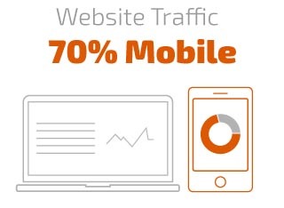
Your audience is mobile first. 70% of today’s web traffic is mobile and 30% desktop. The mobile experience has to match, or surpass, the desktop experience. The limitations of mobiles over desktops required a different way of delivering content to mobile readers.
How the mobile edition is produced
Every publication is created in two versions. One for desktop and one for mobile audiences. For mobile editions the conversion runs through Tiled Rendering, which loads pages on mobile devices with minimal demand on the mobile browser’s capacity. The mobile editions load faster than the desktop editions.
The reason for this is that due to the small displays on tablet and mobile, ’tiled rendering’ imports only the part of the page that is currently needed to fit that display and it then loads the rest, instantaneously, when required.
What is Tiled Rendering?
Tiled rendering is the process of converting a large image into a variety of different resolutions and sizes, then subdividing each of those images into a grid and rendering each section of the grid, or tile, separately.
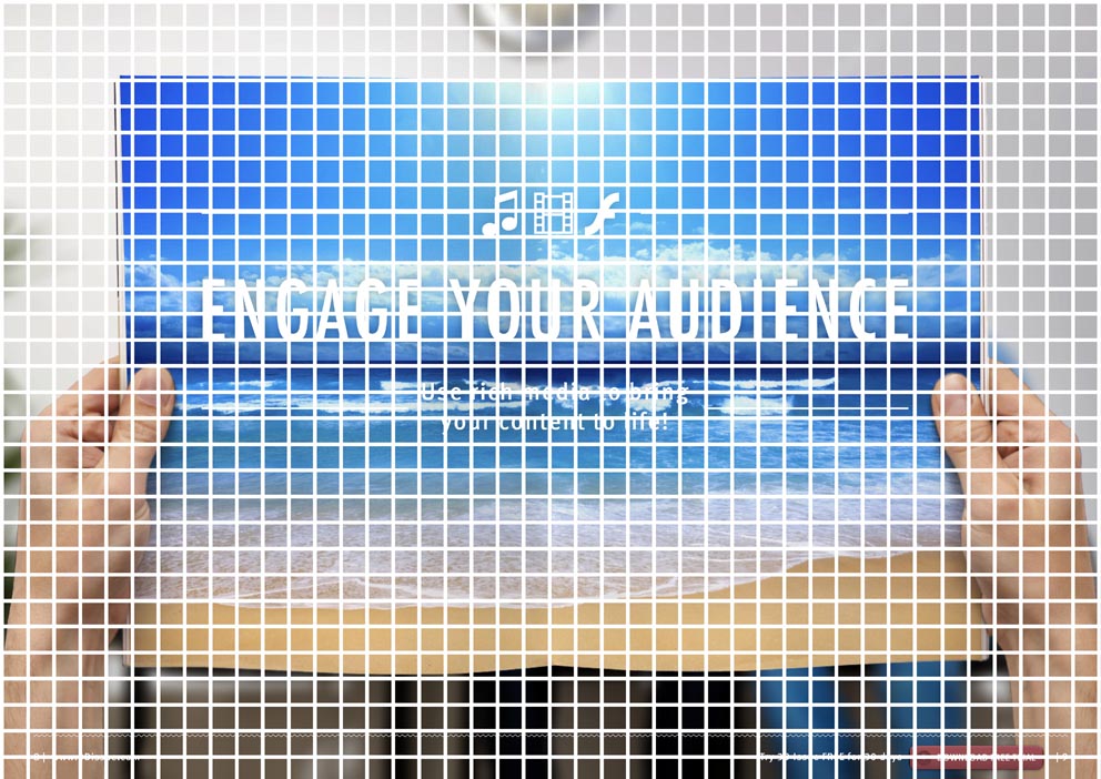
The primary advantage of using this type of rendering is that it minimizes the amount of memory and bandwidth that is used in comparison to downloading the full image.
Tiled rendering systems greatly improve the delivery of high quality image experience on lower powered devices with more limited memory and bandwidth such as mobile devices. On desktops connected with wired connectivity downloading full images can be fast so the need for tiled rendering isn’t essential.
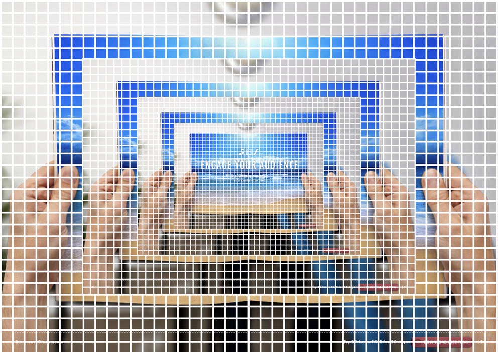
On hand held devices such as tablets and mobiles a readers experience is dependent on the wireless connection, memory of the mobile browsers which is always limited, and the allocated processing power of the mobile browsers. These are huge obstacles to creating a comparable experience on mobile to that of your desktop audience. Tile rendering removes these obstacles by radically reducing the load that is put on a readers mobile device.
The upside…
One of the shortcomings of digital magazines to date is that desktop readers and mobile readers have all used the same files. So mobile readers would have to download the same large files that a desktop reader would. Due to the limited browser capacities, memory allocations and processing power of mobiles, those users were guaranteed to have an inferior experience to their desktop counterparts. Large publications would often freeze on mobile because the device’s browser has reached its allocated storage capacity.

Tiled rendering eliminates this experience gap between the mobile and desktop reader. In fact it leads to a better experience on mobile. The reason for this is that with tiled rendering, your digital magazine only loads the tiles it needs when it needs it and these tile files are tiny which makes the rendering of the image instantaneous.
Compared to the previous experience, this new tiled rendering system has lead to a 5 fold increase in loading time and image rendering, giving your audience a greatly enhanced experience when reading your publications on mobile devices.
The one downside…
The downside to tiled rendering is that it greatly increases the number of files that are created and uploaded with each publication. For each page/image of a publication, the software will break that page into hundreds of tiny tiled images. Although these files are very very small, you are now uploading two publications for each issue that you create. This will double the amount of time that it takes to upload a publication. There’s no way to avoid this if you want to offer a better experience on mobile.
Conversion in the background
Conversion and uploading run in a separate application, so you do not wait for each issue to finish converting and uploading before continuing with other projects.
Now you publish and then move on to other projects while your project converts and uploads in the background.
When a mobile edition is not needed
Not every digital publication is designed for a mobile audience, and the extra mobile edition may not be wanted. An option switches the feature off.
Switching off the Tiler
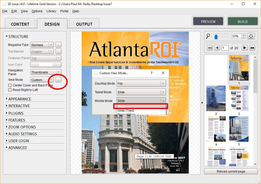
- Open an existing project or add a new PDF publication
- Go to the structure section of the design tab
- After selecting Custom click on the “…” button to the right of the View Mode option
- In the pop up window, click on the Mobile Mode drop down box
- Switch from Slide (Tiled) to just Slide
- Also switch the Tablet Mode to one of the non-tiled options, such as Slide or Presentation
- Then click Build to convert and upload your publication