


Rows and columns are the structure elements that hold your other elements in place. They are how you organize the page into sections and side-by-side layouts.
Rows
A row is a horizontal container. Elements you place in a row sit inside it and are arranged according to the row’s layout. Rows are the main way to group content into a section of the page.
Columns
Columns live inside rows and let you place elements side by side. A row can contain one or more columns, and each column can hold the elements that belong in that part of the layout.
How rows and columns behave
Elements always live in a column. If you drop an element somewhere else on the canvas, Studio wraps it in a new row and/or column automatically. Rows and columns size to their contents by default, but you can set height and width in the Properties panel when you need fixed or constrained sizes.
The row and column toolbars
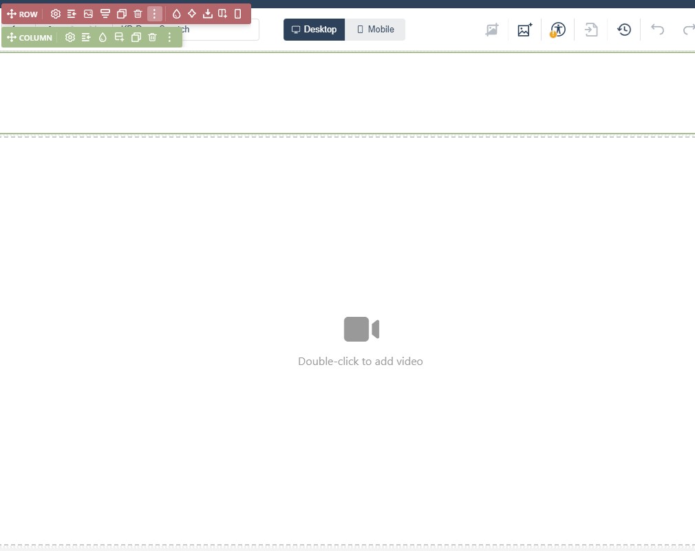
Clicking a row or column selects it and shows its label toolbar. The most-used actions are visible there, and the rest sit behind the three-dots expand.
For rows, the label toolbar typically offers:
- Indent — margins and padding.
- Background image and Background color.
- Insert Columns.
- Duplicate.
- Save as a Block.
- Delete.
- Select Parent Element.
Columns swap Insert Columns for Insert Rows.

In Flow
In Flow, rows and columns still form the structure of the page, but the layout is reflowed for smaller screens. That means side-by-side column layouts often stack vertically on mobile, so the structure is the same but the on-screen result can be different.