


The Table element places a table on the page. It is available from the Add panel among the structure elements, and it exposes table-level and cell-level settings so you can shape the layout and content of the table.
Adding a table
Open the Add panel and insert the Table element from the Elements list by clicking it or dragging it onto the canvas. The table lands on the canvas with placeholder rows and columns that you can edit.
Table settings
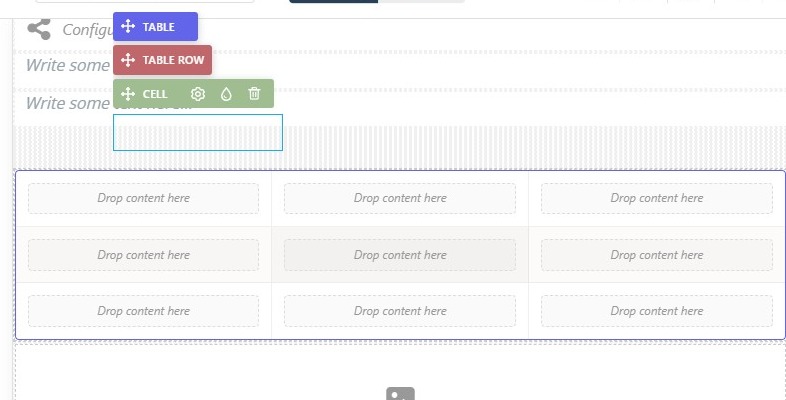
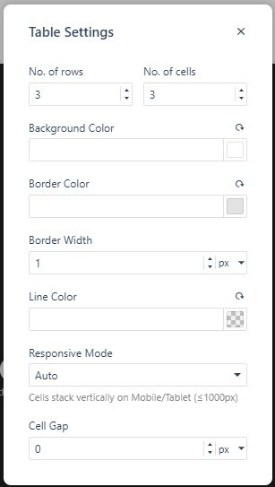
Selecting part of the table shows a toolbar for each level of the hierarchy. Click Select Table to reach the TABLE bar, then open Table Settings to configure the whole grid:
- No. of rows and No. of cells, which resize the grid.
- Background Color, Border Color, Border Width, and a separate Line Color for the cell separators.
- Responsive Mode — Auto, Wrap, Scroll, or Cards on Mobile — plus Cell Gap.
Cell settings
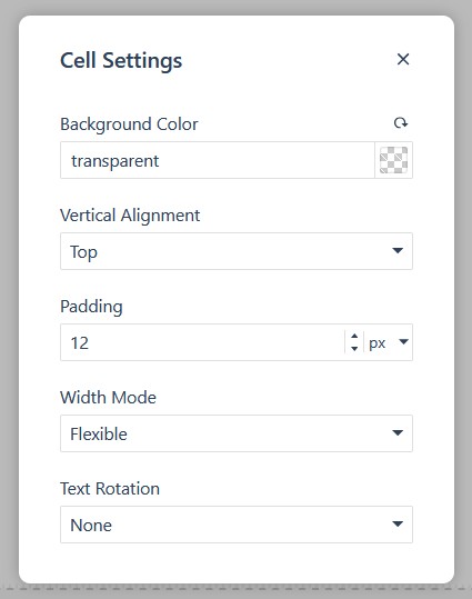
Select an individual cell to edit its content and appearance; the CELL bar carries Cell Settings, with Background Color, Vertical Alignment, Padding, Width Mode, and Text Rotation, so each cell can be styled independently.
The Properties panel
Like every element, the Table exposes the full Properties panel — Size, Spacing, Background, Settings, Border, Animations, Advanced, Overlay, and Accessibility — so you can control its dimensions and spacing alongside the rest of your elements.
In Flow
In Flow, the Table element is available in the same way, but preview it on desktop, tablet, and mobile. Tables can be hard to read on small screens, so check whether your table reflows cleanly or needs adjusting for narrower layouts.