


The Logo element places a logo on the page. It is brand-aware, which means it pulls its variants from your Brands configuration rather than from a one-off image upload.
Adding a logo
Open the Add panel and insert the Logo element from the Elements list by clicking it or dragging it onto the canvas. Open Logo Settings to choose the variant you want.
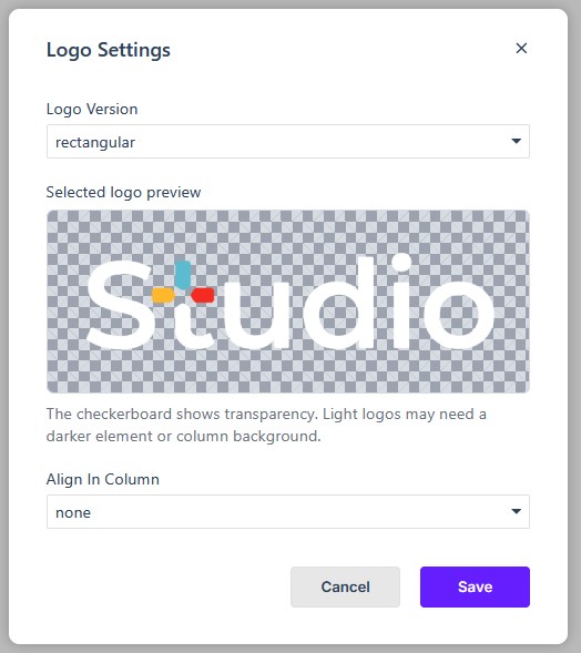
Logo Version
In Logo Settings, choose the variant that suits the background the logo sits on:
- Rectangular
- Rectangular inverse
- Square
- Square inverse
Preview and transparency
In the dialog, the preview’s checkerboard background shows where the logo is transparent. The checkerboard is part of the preview, not the published page. Light logos may need a darker element or column background behind them so they remain visible.
Align in column
You can also set how the logo aligns within its column:
- None
- Left
- Center
- Right
- Around
- Between
The Properties panel
Like every element, the Logo exposes the full Properties panel — Size, Spacing, Background, Settings, Border, Animations, Advanced, Overlay, and Accessibility — so you can control its dimensions and spacing alongside the rest of your elements.
In Flow
In Flow, the Logo element works the same way and still pulls its variants from your Brands configuration. Because Flow reflows the layout for smaller screens, check the logo in preview on desktop, tablet, and mobile so it still sits well in the column at each size.