

Blocks are pre-designed sections (a team grid with photo slots, a contact strip with form and social links, a card row for products) built from the same rows, columns, and elements you place by hand. Drop one in, swap its content, and a page section is done. The basics (where Blocks live, saving your own) are in Working with Blocks, Layouts, and Templates; this guide is the working method: how blocks are built, how to make your own that survive being reused, and the designs worth knowing.
What a block actually is
Every block, Studio’s or yours, is a single Row with everything nested inside it. That’s the rule your own blocks must follow, and the reason a saved block can be dropped onto any page and edited like any other content. Inside the Row, blocks are ordinary structure (columns, elements, spacing), so once a block lands on the canvas you can change anything about it: swap the text, replace the photos, recolor, delete what you don’t need.
Building a block that survives reuse
The point of a custom block is that future-you (or a teammate) can drop it in and get a finished section, not a puzzle. Three habits do most of the work:
- One Row, complete contents — build the section first, then save the outermost Row via its label’s Save as Block action (name it and pick a category). If the arrangement spans more than one Row, it isn’t one block; build it as a layout instead (burger menu → Save Page as Layout, see e-19).
- Design for swapping — use placeholder content that shows the intent (real-length headings, properly cropped images) so the block reads right before any edits. Anything you would have to fix every time is a sign the block should be more generic.
- Check it responsively — flip the canvas between Desktop and Mobile after saving: a block that only works at desktop width will fight you on every phone-shaped page it lands on (see Spacing, Padding, Margins, and Units of Measurement for how the responsive rules cascade).
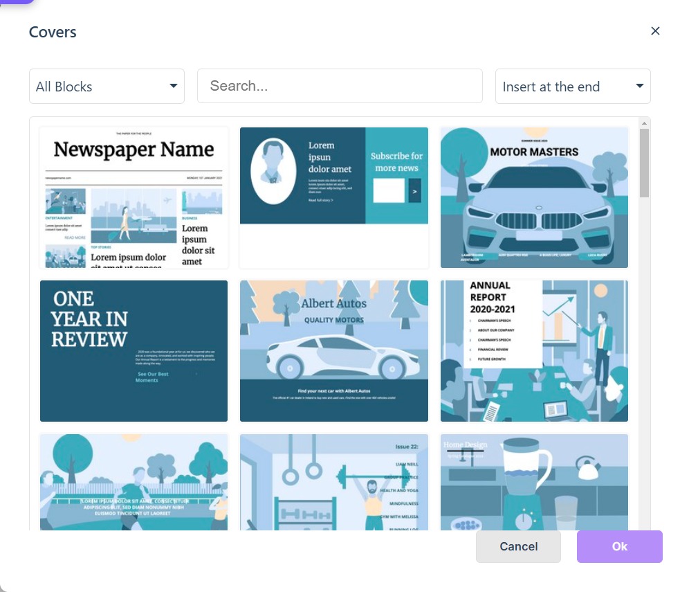
Once saved, your blocks live in the library’s My Blocks under the category you chose; add them from the Blocks section of the Add panel like any other block. The picker opens on the category you clicked, with an All Blocks filter, a search field and a placement selector; choose the block, set the placement to start or end, then click Ok (or double-click the block).
Choosing between a block, a layout, and a template
- Block — one Row: a section of a page (team grid, contact strip, product cards). Reusable across any page or project.
- Layout — a whole page design; adding one replaces what’s on the page. Best when you rebuild the same page shape often (a monthly issue’s opener, say).
- Template — a complete starting point for a new project, carrying pages, styles, and structure from the first screen.
Three designs worth knowing
Three block designs carry most page-building work; all three remain the patterns to reach for:
- Card blocks — image-plus-text tiles for product descriptions, store links, or teaser text pointing at a longer article. Repeat a card row and a catalog page builds itself.
- Graph blocks — full- or part-page data displays; text and styling edit from the toolbar like any element.
- Video blocks — descriptive text on the left, the video on the right; pick media from the media library (see Working with Images, Galleries, and Logos for what the library holds).
Headers, for breaking up a page
The Headers category in the Blocks section holds blocks built for one job: separating text-heavy sections, or signposting that the topic changes. A header block arrives already spaced, so a section break does not mean setting padding and margins either side of it. Add one from the picker like any other block, then extend it: text, images and other elements drop into its Row and are edited in place.
When the canvas is too crowded to select anything
Blocks nesting blocks, plus labels on everything, can make canvas selection a maze. Two escapes: click through a block’s layers by selecting the Row first and working inward, or use the Layers panel (and the Structure view’s basic Rows-and-Columns outline) to select and reorder without hunting on the canvas (see Managing the Layers Panel).
For the Add panel itself, see Working with Blocks, Layouts, and Templates; for the elements a block is made of, start at Configuring Element Properties.