

Three layout elements sit in the Add panel’s Elements list alongside the content elements: Rectangle (shapes and color panels), Line (dividers), and Spacer (deliberate empty space). None of them carry content of their own — they shape the page around the content that does.
Rectangles
Choose Rectangle in the Add panel and it lands as a solid black block sized to its column. A rectangle has no settings dialog: its label bar carries AI Assist, Indent / Spacing, Background color, Duplicate, and Delete, and its look is controlled from Properties:
- Background: solid color, a background image, gradients, filters, blend modes, and an Enable Effects switch. A rectangle with a background image is the simplest way to place a decorative panel behind text.
- Border and Overlay: frames and overlay effects, same as any element (see Configuring Element Properties).
- Size: exact width and height in px or %. Spacing: the margin and padding that position it in its column.
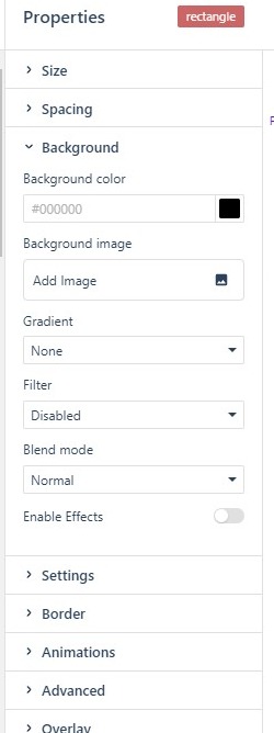
Rectangles are also the standard canvas for Animations and Overlay effects, and they respect Visibility (hide on Desktop, Mobile, or the accessible version) like every element (see Configuring Element Properties) — a common pattern is a decorative shape that shows only on desktop.
Lines
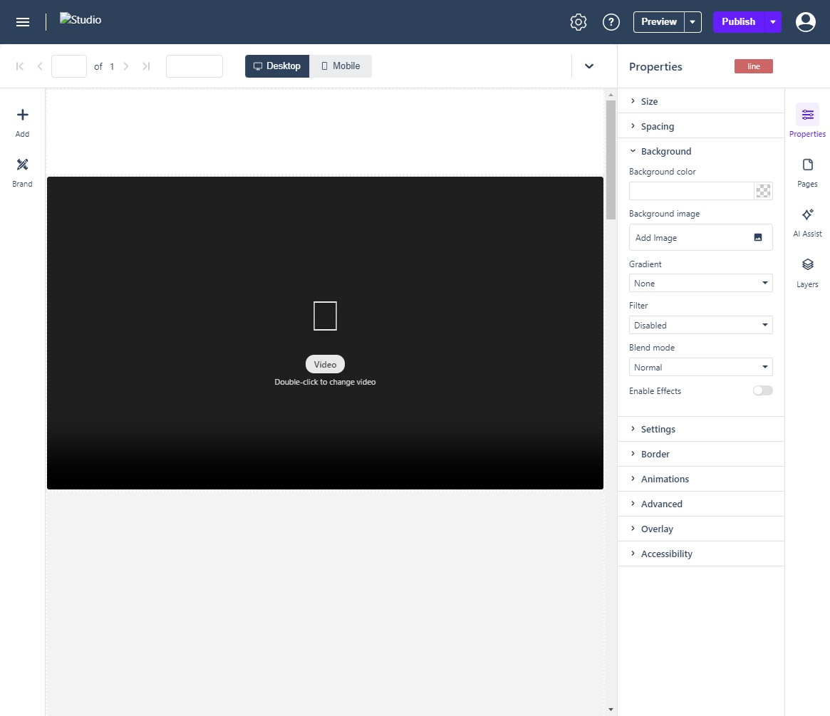
A Line is a rule for separating content. Click Line Settings on its label bar to set the Layout (Horizontal or Vertical), Thickness, and Color, then Save. The same values sit in Properties: Size and Spacing set its length and position, Background holds color, gradient, and effects, and Border sets its width, style, and color. Lines are lightweight and load instantly — prefer them to images for dividers.
Spacers
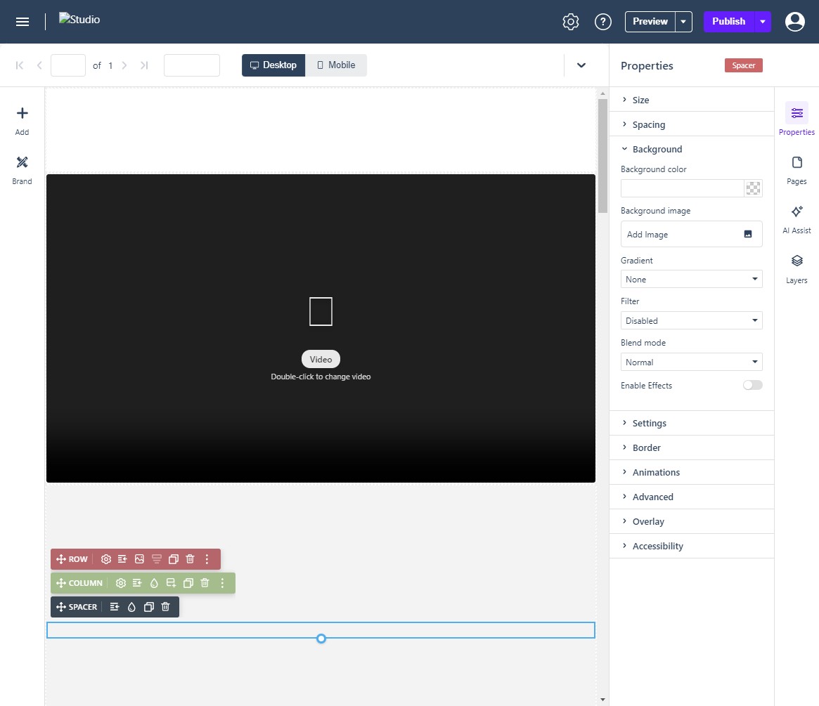
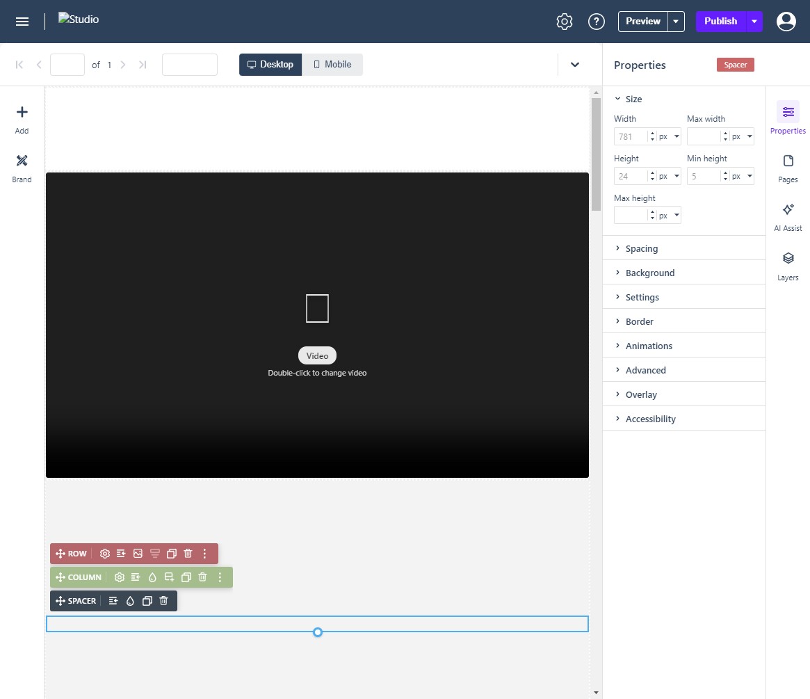
A Spacer is an empty block that creates deliberate space. Place one between rows to push content apart. Like a rectangle, it has no settings dialog: its label bar carries AI Assist, Indent / Spacing, Background color, Duplicate, and Delete, and its main setting is Size (height), which you can drag on-canvas or set exactly in Properties.
White Space, Alignment, and Moving Content
- Adding white space: use a Spacer for vertical gaps inside a column; use Spacing (padding) when the gap belongs to the element itself.
- Aligning content: drag elements into place; the canvas shows alignment guides against neighboring elements. Precise positions come from the Size and Spacing values.
- Moving content: drag elements between columns (or use the Layers panel for precision); Clone on the element toolbar duplicates the element in place.
Shapes and lines respond to the responsive engine like any element: check each breakpoint (Desktop / Mobile) after sizing, because a fixed-height spacer that works on desktop can crowd a mobile layout.