


The Embed element lets you place external web content on the page — a YouTube or Vimeo video, a Google Map, a booking widget, a social post, or anything else that offers an embed URL. Where the Video element handles video files and players (see Video), Embed renders whatever the service shares through its embed URL, inside your layout.
Adding an Embed element
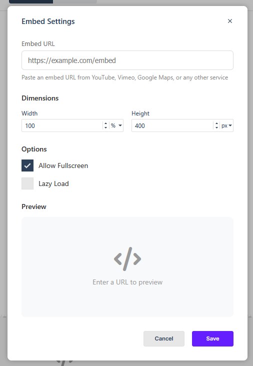
Open the Add panel and insert the Embed element from the Elements list by clicking to add to the bottom of the current page, or by dragging it to the desired position on the Canvas. Once it is on the Canvas, double-click it or click the settings cog in its label to open Embed Settings and configure the element.
Embed Settings
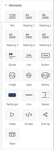
The Embed Settings dialog has these parts:
- Embed URL — paste the embed URL you want to use. The dialog accepts URLs from YouTube, Vimeo, Google Maps, or any other service that publishes one. A helper prompt suggests sources such as YouTube, Vimeo, Google Maps, or any other service.
- Width — the width of the embed. Can be set as %, vw or px.
- Height — the height of the embed. Can be set as %, vh or px.
- Allow Fullscreen — on by default. Allows readers to expand the embedded content to full screen when the service offers it.
- Lazy Load — off by default; defers loading the embed until the reader scrolls near it. Recommended for pages with several embeds, so the page opens faster.
The rest of the element behaves like any element
The Embed element carries the standard Properties sections — Size, Spacing, Background, Border, Animations, Overlay, plus Settings → Visibility (hide on Desktop, on Mobile, in the accessible version, or everywhere) and Accessibility (see Configuring Element Properties). Name the element in Element Name so it’s easy to find in the Layers panel and to target with links.
When you are done, choose Save to apply the settings or Cancel to leave them unchanged.
In Flow
In Flow, the Embed element is available in the same way, but Flow reflows the layout for smaller screens. Embedded content that works well on desktop may need checking on tablet and mobile, especially if it has its own fixed width or behavior.