

Interactive navigation in Studio comes from two elements in the Add panel’s Elements list (Link and Button) plus a Sharing element that lets readers post the project to social media. The element has a page of its own: Sharing.
Inserting a Link or Button
Open the Add panel and insert Link (placeholder: “Write the link caption here…”) or Button (placeholder: “CLICK HERE”), by clicking it or dragging it onto the canvas. Both are the same control in different clothes: each opens one shared settings dialog, and either can be switched to the other look at any time.
The Edit Dialog
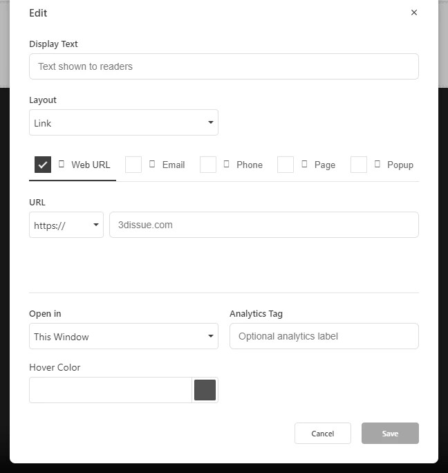
Select the element and open Link Settings. The dialog offers:
- Display Text is the caption readers see.
- Layout — Link (plain text) or Button (clickable button styling).
- Target type offers five choices, described below.
- Open in chooses This Window or New Window.
- Analytics Tag — an optional label so link clicks are identifiable in your analytics.
- Hover Color — the color the link or button turns on hover.
Link Targets
- Web URL takes any web address, with a protocol picker (https://, http://, Other).
- Email — an email address; see Link for its optional prefills.
- Phone is a phone number for tap-to-call.
- Page — an internal jump. Choose the page (“Select a page…”), then optionally fill Target Element Name: “Jump to a named row or element on the page”. The name must match a row named via Row Settings, as described in Naming Rows and Creating Anchor Links; matching is exact, so use the same spelling and case.
- Popup — a Popup URL that “Opens the URL in a lightbox overlay”.
The Sharing Element
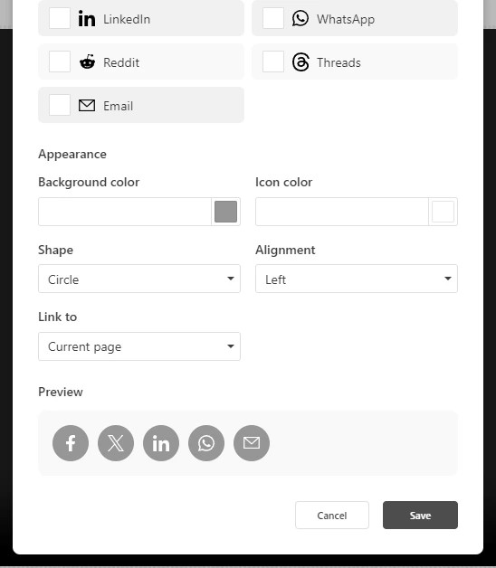
The Sharing element (Add → Elements) inserts a row of social share icons. Its Social Media Sharing dialog has two sections:
- Platforms ticks which appear: Facebook, X (Twitter), LinkedIn, WhatsApp, Reddit, Threads, and Email. Sharing covers the dialog and which platforms start ticked.
- Appearance holds Background color and Icon color, Shape (Circle or Square), and Alignment (Left/Center/Right), with a live Preview.
The Link to setting decides what readers share: Current page (the page the element sits on) or First page (the start of the publication). Sharing uses the project’s published link, so the element is only useful once the project is published; see Publishing and Sharing Your Studio Project.