

Studio’s Table element lays content out in a grid, where each cell is a drop zone that accepts anything a page can hold. (Collecting reader responses is the Form element’s job; see Working with Forms.)
Inserting a Table
Open the Add panel and choose Table from the Elements list by clicking it or dragging it onto the canvas. Studio inserts a table with a default 3×3 grid of cells; each cell is a drop zone that accepts text, images, and other elements just like a column, so a table can hold anything a page can.
Arranging Rows and Cells
Selecting part of the table shows a toolbar for each level of the hierarchy:
- TABLE: Table Settings, Background color, Add Row, Indent/Spacing, and Delete Table.
- TABLE ROW: Row Settings, Background color, Add Cell, and Delete Row.
- CELL: Cell Settings, Background color, and Delete Cell.
The Properties panel offers the full menu set for the selected level (Size, Spacing, Background, Settings, Border, Animations, Advanced, Overlay, Accessibility).
Table Settings
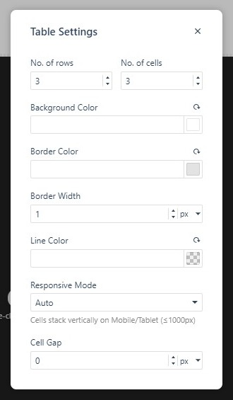
The Table Settings dialog controls the grid and its appearance:
- No. of rows and No. of cells — resize the grid; cells are the columns of each row.
- Background Color, Border Color, and Border Width (px/rem/em), plus a separate Line Color for the faint cell separators.
- Responsive Mode — Auto, Wrap, Scroll, or Cards on Mobile. Auto lets cells stack vertically on Mobile/Tablet screens (≤1000px), so wide tables stay readable on small devices.
- Cell Gap sets the spacing between cells (px/%/rem/em).
Cell Settings
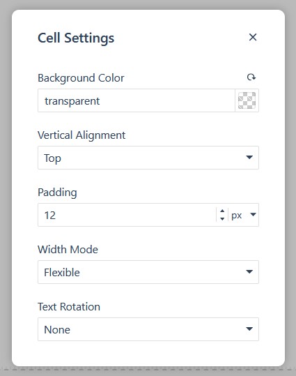
Each cell has its own settings: Background Color, Vertical Alignment (Top/Center/Bottom), Padding, Width Mode (Flexible or Fixed), and Text Rotation: None, 90° (Bottom to Top), -90° (Top to Bottom), or 180° (Upside Down), handy for tight header columns.
Responsive tables
Wide tables are where small screens bite, and Responsive Mode is the fix: Auto stacks cells vertically on Mobile/Tablet screens (≤1000px) without any extra work. Pick Wrap, Scroll, or Cards on Mobile when a table needs a different behavior, and preview on the mobile canvas to confirm the choice reads well (see Testing your publication on mobile devices).