Studio provides three dedicated media elements — Image, Gallery, and Logo — all available from the Add panel under Elements. Each is inserted into its own row on the canvas and offers a floating toolbar plus a dedicated settings modal.
The Image Element
Insert an image from Add → Elements → Image by clicking it or dragging it onto the canvas, then double-click the placeholder to add your picture. The element toolbar gives you:
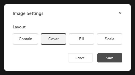
- Image Settings: Choose how the picture fits its frame — Contain, Cover, Fill, or Scale — then Save or Cancel.
- Replace: Swap the image while keeping its position and size.
- Crop: Trim the image directly on the canvas (active once a real image is placed).
- Link: Make the image clickable.
- Indent / Spacing, Duplicate, Delete: The standard element actions.
For a picture that loses an edge in its frame, Why is my image cut off? works through these fit options.

Like every element, the Image exposes the full Properties panel — Size (Width, Max width, Height, Min/Max height with px/%/rem/em/vw/vh units), Spacing, Background, Settings, Border, Animations, Advanced, Overlay, and Accessibility.
The Gallery Element
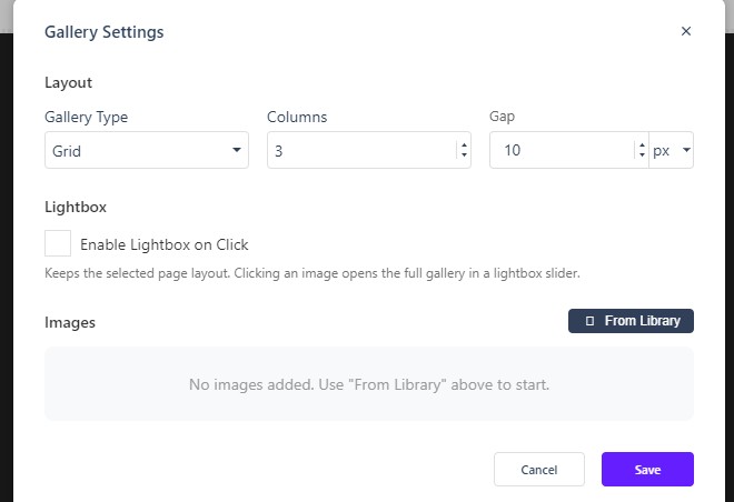
Insert from Add → Elements → Gallery by clicking it or dragging it onto the canvas. Double-click the placeholder to add your pictures. Open Gallery Settings to configure:
- Gallery Type: Grid, Slider, or Masonry.
- Columns: The number of columns (default 3).
- Gap: The spacing between images (default 10, with unit picker).
- Lightbox: Enable Enable Lightbox on Click so readers can open the full gallery in a lightbox slider while keeping the selected page layout.
- Images From Library: Use From Library to pick the pictures for the gallery.
The element’s own page, Gallery, documents the same options from the element side.
The Logo Element
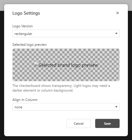
The Logo element is brand-aware: instead of uploading a picture, it pulls the logo variants configured in your Brands. Open Logo Settings to choose:
- Logo Version: rectangular, rectangular inverse, square, or square inverse — pick the variant that suits the background it sits on.
- Preview: A checkerboard behind the preview shows transparency; light logos may need a darker element or column background.
- Align In Column: none, left, center, right, around, or between.