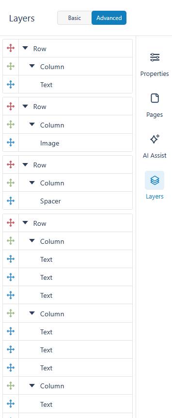
The Layers Control Column provides a structural overview of all elements on your active page. This allows you to see how elements are nested within each other. You can also click and drag on the arrow icons to the left of the panel to easily select, organize, and manage complex layouts.
Understanding Element Hierarchy
The interface uses visual cues to indicate how elements are nested within your document flow.
- At the top of the panel, you can toggle your view between Basic and Advanced modes.
- In the Advanced view, elements are strictly categorized by color and nesting order. For example, a red icon denotes a parent Row, a green icon indicates a nested Column, and a blue icon represents an actual element, such as Text.
- Each layer features a Move drag handle on the left side, in the form of an arrow icon which you can click and hold to drag elements into a new position on the page.
- Warning indicators, such as an orange exclamation mark, will appear directly next to an element’s name if there is a configuration issue that needs attention.
Element Options Menu
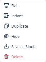
Clicking the three-dot Actions icon on the right side of any individual layer opens a dedicated options menu for that specific element. This menu provides several quick actions:
- Stack: Stack a row’s contents vertically on desktop.
- Indent: Adjust the element’s margins and padding.
- Duplicate: Create an exact copy of the selected element.
- Hide/Show: Hide or show the element in your project, both on the Canvas and published version.
- Save as Block: Save the selected element and its current configuration as a reusable block.
- Delete: Permanently remove the element from your project using the red trash can option.