

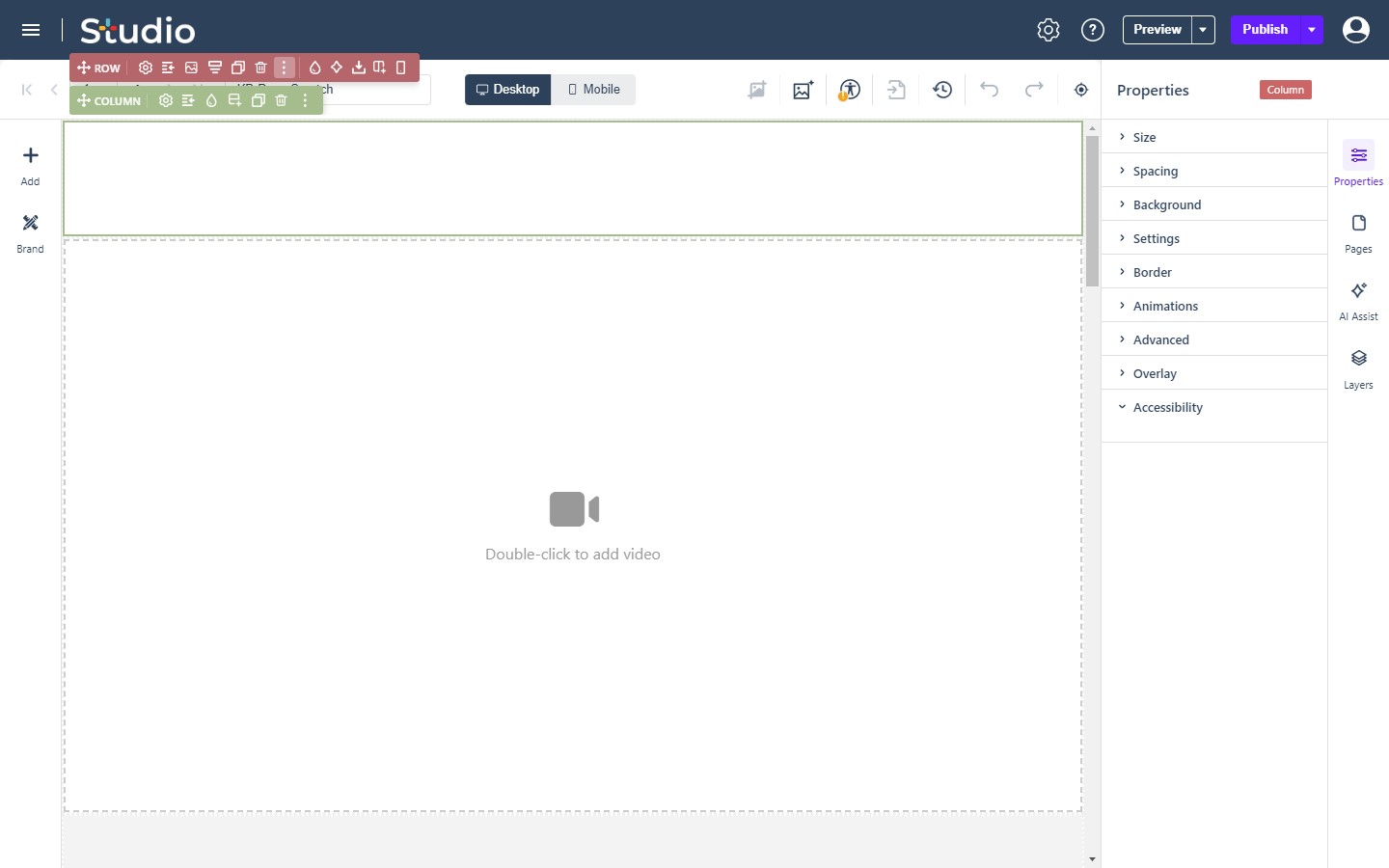
When you select an element on the canvas, the Properties panel provides control over its appearance, layout, and behavior. The settings are organized into several collapsible menus.
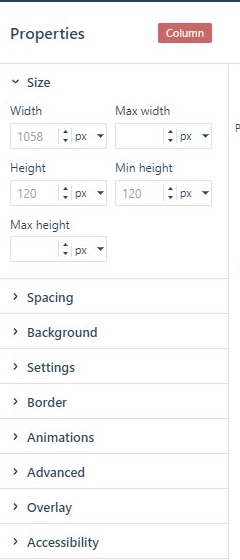
Size
- Size: Control dimensions by setting values for Width, Max width, Height, Min height, and Max height. These can be set as %, px, rem, em or vw. Leaving a value blank will set the property to ‘auto’.
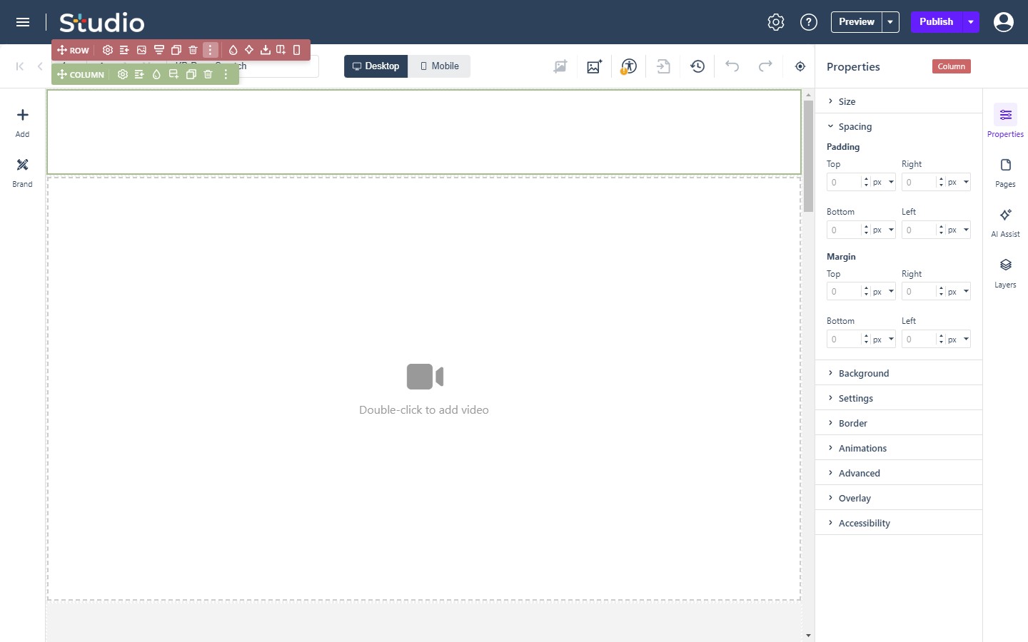
Spacing
- Spacing: Define internal element spacing using the Padding settings (Top, Bottom, Right, Left) and control external spacing using the Margin settings. Both accept px, %, rem, em, vw, or vh units.
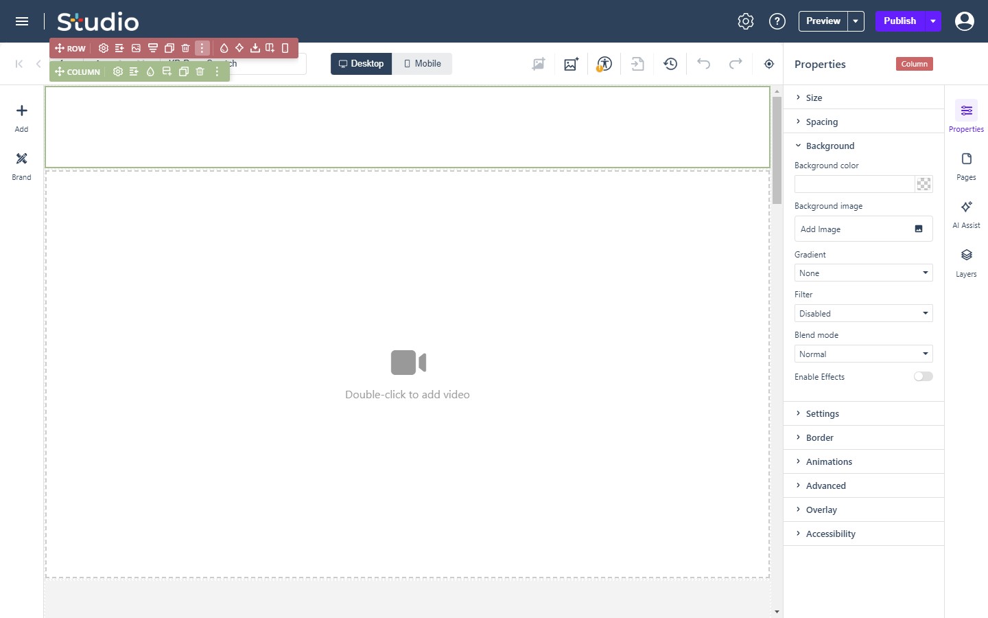
Background
- Background: Apply a solid Background color, upload a Background image, or configure a Gradient. This menu also allows you to apply a visual Filter (Grayscale, Sepia, Blur, Brighten, or Contrast), set a Blend mode, and toggle the Enable Effects switch. Background images add Background size, Background position, Background attachment, and Background repeat controls (attachment: scroll, fixed, or local) for sizing and tiling the image within the element.
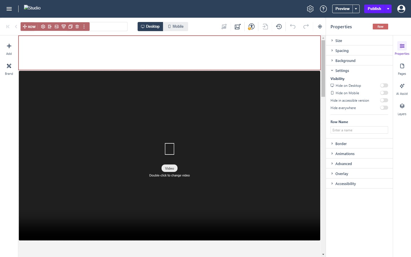
Settings
- Visibility: Under the Visibility section, use toggle switches to selectively Hide on Desktop, Hide on Mobile, Hide in accessible version, or Hide everywhere.
- Name: assign a custom organizational label using the Row/Element Name field.
Borders
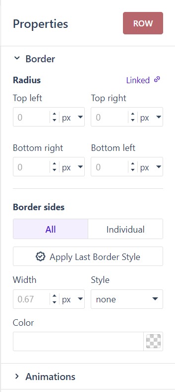
- Border: Configure the border Radius for all four corners, which can be linked for uniform rounding. Define the border Width, Style, and Color, and choose to apply these settings to All sides or Individual sides.
- Apply Last Border Style: the button under the All/Individual switch copies the border last set on another element onto the selected one, so a frame or divider is repeated instead of retyped.
Animations
- Animations: Select an entry Animation style from the dropdown, such as Slide Up. Styles include Fade, Slide, Zoom, and Flip variants. The full set of types, with duration, delay, easing and distance, is Animating Elements.
Advanced
- Advanced: Define the element’s Position behavior (Static, Relative, Absolute, Fixed) and adjust its overall Opacity. Add a custom Shadow by defining the color, horizontal and vertical offsets, blur, spread, and type. You can also configure a Hover state with custom Hover text and a Rollover color.
Overlays
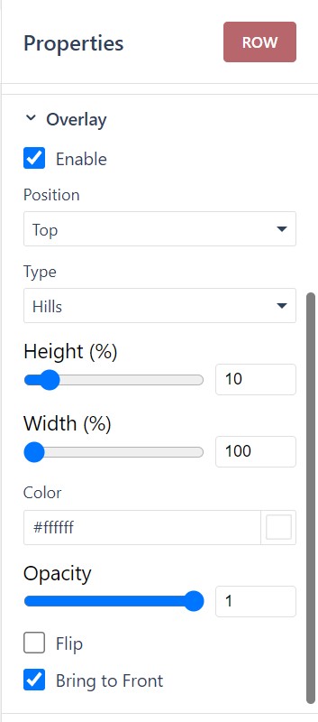
- Overlay: Check the Enable box to add decorative shape overlays to the element. Customize the Position, Type (such as “Hills”), dimensions using Height (%) and Width (%) sliders, Color, and Opacity. Additional checkboxes allow you to visually Flip the graphic or Bring to Front.
Accessibility
- Accessibility: Ensure your content is properly structured for screen readers by selecting an appropriate semantic tag from the Role dropdown menu. Available options include Paragraph and Heading 1 through Heading 6.
Two of the elements this panel serves have reference pages of their own: Rectangle (e-191) for the shape element, and Table for tables, whose table- and cell-level settings sit alongside the shared properties above.