

The Studio editor has two rails: the Add panel and Brand rail on the left, and four Control Columns on the right — Properties, Pages, AI Assist and Layers — holding everything you place, style and arrange on a page. The interface names those four panels one at a time — each has its own icon in the rail and its own label — so Control Columns is this guide’s collective name for them, not a heading you will find on screen.
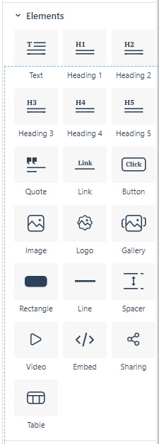
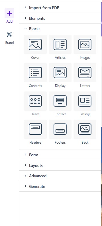
The Add button at the top of the left-hand rail opens the Add panel, which supplies everything you place on the canvas — from a single heading to a complete page layout. Open it and choose a section: the Elements list for individual building blocks, Blocks for pre-built composite designs, and Layouts for full-page templates that replace the page when added.
- Elements lists the individual building blocks of your design — text, images, galleries, logos, video, and embeds.
- Blocks holds pre-built composite designs — combinations of rows, columns, and elements that you can drop onto the page and then edit like any other content.
- Layouts contains fully-built page layouts that replace everything currently on the page when added.
The Brand rail sits at the bottom of the left-hand rail and applies your organization’s fonts, colors, and logos across the project.
Properties
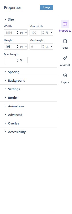
The Properties column on the right-hand side serves as the main styling and configuration hub.
- This panel dynamically updates based on the specific element you have selected on the canvas.
- It provides a series of collapsible menus to adjust granular settings, including Size, Spacing, Background, Settings, Border, Animations, Advanced, Overlay, and Accessibility.
Pages
The Pages column on the right-hand side manages the overall pagination and structure of your document.
- It displays visual thumbnails of all the pages currently in your project.
- Use the purple + button at the bottom to add new pages, or the trash can icon to delete the currently selected page.
- Clicking the ellipsis (…) menu at the top of the column provides document-wide page actions like inserting, moving, duplicating, locking, or unlocking pages.
AI Assist
The AI Assist column on the right-hand side integrates a chat-based artificial intelligence tool directly into your workflow.
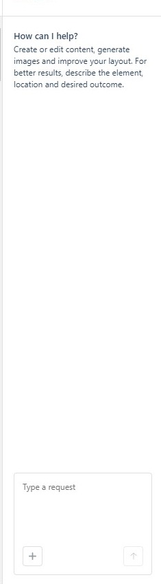
- It can create or edit content, generate images, and improve your layout.
- You can interact with the AI by typing requests into the chat input box at the bottom of the panel.
- The tool is context-aware; if you have a specific element selected on the canvas, a tag (for example,
bootstrap-col) may appear at the top of the panel, allowing you to ask for targeted help with that specific structural element.
Layers
The Layers column on the right-hand side provides a structural map of how elements are ordered and nested on your active page.
- You can toggle the view between Basic and Advanced modes at the top of the column.
- The Advanced view displays a color-coded hierarchy, showing exactly how elements like Texts are nested inside Columns, which are in turn nested inside Rows.
- Clicking on an element in this column will also select the element on the canvas.
- Clicking the vertical three-dot icon next to any layer opens a menu to Indent, Duplicate, Hide, Save as Layout, or Delete the element.